The Airfix Responsive Workflow
I had an epiphany recently regarding one of the biggest concerns around adopting a responsive methodology for web projects — workflow.
People have been stating that responsive design projects require a fundamental shift in the web design workflow we have become accustomed to from years of building fixed layouts based on flat images that try to represent a website. I believe the shift is actually relatively small, in fact you might be working this way already.
After a critical evaluation of my previously established workflow, I came to the same conclusion a lot of pundits have already arrived at: flat compositions just don’t work. They are as useful as a photograph of a web page, they don’t represent interactions, the infinite canvas, how typography behaves, and so on. Compositions set an unrealistic goal, a rainbow for web developers to chase to the end of a project with scattered showers of compromise and disappointment along the way.
I realised an additional enlightening thought: the design phase is ethereal throughout the project, an entity that permeates through the different stages of a project lifecycle. It moves, it’s supple, it adapts. Sound familiar? Allow me to walk you through my refined process for responsive projects1.
Wireframes
When I wireframe I usually iterate from very low fidelity sketches with initial ideas up to a medium fidelity sketch with general layout decisions, content considerations and components to document in a functional specification2.
This is where the small changes to my process begin. After annotating my wireframes to correspond with the functional specification I use an additional copy of the wireframes to label typography and modular components with reference numbers. Similar pieces can be labeled with the same colour or other categorisation techniques to help with the next step of the process.
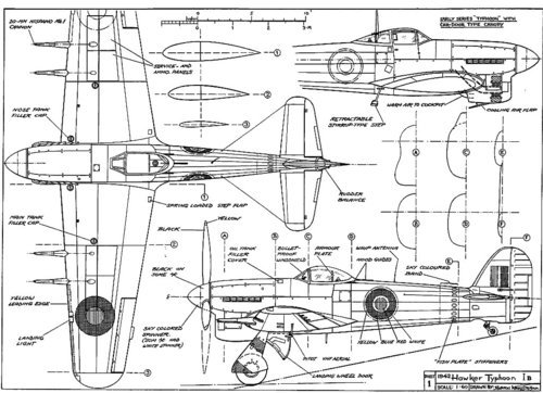
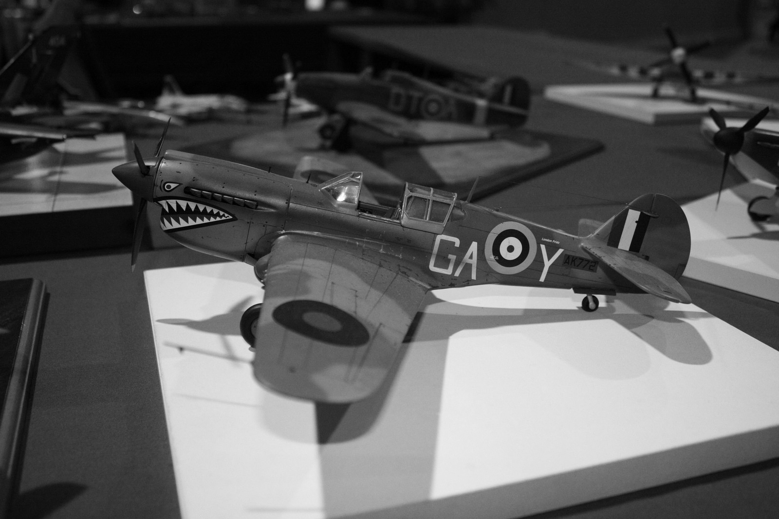
The wireframe begins to resemble a set of instructions for an Airfix kit. Identical pieces of the wireframe that are intended to be reused are given the same reference number. The reference numbers correspond to the next part of the process which may be the biggest change depending on how you work.
Style Guide
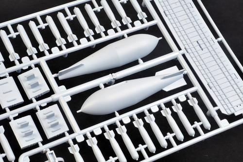
The wireframe numbers correspond to components in the live HTML style guide. This is the heart of the design phase. After accounting for all pieces in the wireframe, you will be in a position to construct a complete style guide covering typography and modular components ready for use throughout the website. It serves a similar purpose to the pieces of an Airfix kit.
We are now in the ideal position to design in the browser — there will almost certainly be assets you still need a graphics package to create, I’m not dismissing their effectiveness for quickly testing colour and type combinations altogether either. Photoshop/Fireworks still serves a definitive purpose in my workflow albeit a much less significant role than before — mainly asset generation.
Functional Prototype
This step of the process remains unchanged. Here I build the functionality (not design, not layout) documented in the functional specification. This stage is only complete when all functionality is tested and complete.
Customised Prototype
The wireframes and style guide play a pivotal role in this methodology. They are schematics — instructions for assembling model using pieces from the style guide kit. The typographical components and modules in the HTML style guide are the pieces that you assemble according to the wireframes to build the model. This is where the design in the browser happens.
Using the wireframes as a guide for shaping the layouts in terms of proportions we can then quickly piece together detailed design layouts on top of a fully functional prototype, we can make adjustments to things that don’t work so well and quickly iterate. It’s almost like painting by numbers — it’s that easy.
I wasn’t fully sold on designing in the browser until I tried this approach. By stepping into the browser sooner, you can make more informed design decisions without shooting yourself in the foot down the line. The style guide is key to the success of this approach, the more flexible the pieces are, the better they will fit into the overall model.
In summary, the biggest change is dropping flat compositions as a deliverable — they are a heavy piece of the process that set false expectations. Perhaps they may still be of use internally for quick visualisation purposes, but they are damaging to responsive projects if treated as a deliverable. Wireframes should be given more prominence as a set of instructions that inform both the creation of the style guide as well as informing the shape of the layout when it comes to customising a functional prototype using the style guide. The wireframes should be a conceptual model of the final product, not the definitive model. This process involves greater communication with your clients which is a good thing. The style guide is presented much like Samantha Warren’s Style Tiles with the message that it contains the building blocks of the complete model. Like any process, there is always room for improvement — I would love to hear your thoughts if you have any further ideas or insights from your own process. This works for me, I hope it helps you too.
-
This isn’t the complete process, I have left out the discovery and planning phase as it will be unaffected by the changes above. ↩
-
A functional specification is a document detailing how components work along with corresponding references to the wireframes. It’s a useful deliverable that doubles up as a test plan. ↩