Thoughts on Toggling a Responsive Design On and Off
Earlier today Roger Johansson posted an article about potential scenarios for disabling a responsive design along with a demo. As noted in the article, this isn’t new thinking as both Bruce Lawson, Chris Coyier and various others have spoken about it before — the purpose was to introduce the demo along with scenarios where it would be useful.
I can’t figure out what my stance is on the approach. I’m leaning more towards thinking that this is a good idea. Some view the inclusion of an off-switch as an admission of failure in the implementation of a responsive design — I’m not so sure it is. Chris Armstrong put it nicely on Twitter:
RWD involves making assumptions on the user’s behalf, why not allow them to be overriden?
I wish I had a toggle for the bad responsive designs, the ones that “don’t get it” (i.e they hide content and bastardise the experience rather than adapt it appropriately). Even if we have examined and tested our assumptions thoroughly, there is always a chance that we’ll get something wrong and I think users deserve a chance to undo something we impose on them (with good intent).
Roger’s article discusses the language around the toggle switch:
The trickiest part is probably what to call the switch. Phrases like “View desktop layout”, “Go to desktop version” and “View full site” seem like saying that what you’re currently viewing is missing something. So instead I called it “View fixed width layout” (and “View flexible width layout” to toggle back). I don’t really know if it helps end users understand the difference, but I think it’s a more accurate description than using “desktop” and “mobile”. Someone’s browser window being narrower than 960 pixels, or 1200 pixels, or wherever you choose to draw the line, does not necessarily mean they’re using a “mobile” device.
After years of m-dot websites users have been conditioned to feel that “View desktop site” means that the page is hiding something from them. That’s why I think trying to add language to the switch won’t work, it may create the feeling of deception that exists with many m-dot sites. Also using terms like “fluid” and “fixed” will mean nothing to the average user. The language would need to feel familiar and create an expectation — although in this situation, the user’s expectation is that the button will reveal a “full version” revealing the stuff that the page is hiding.
I think we could do something visually rather than give it confusing and misguided terms. I’m not saying this suggestion is the definitive approach, it’s more of a rough idea. The image below gives you an idea of what an icon might look like before and after it is toggled.
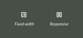
The left icon shows what it might look like in a standard responsive layout with the option to toggle a fixed width layout, the right shows how it would look from the fixed width layout if the user wanted to switch back to a responsive layout.
Again — this is just a rough idea using a couple of repurposed icons, if you do decide to implement an off switch, then I suggest trying a visual reference rather than potentially confusing wording.