Responding to environmental lighting with CSS Media Queries Level 4
Media Queries Level 4 builds upon the existing media queries specification that many of us use when we build responsive designs today. The Media Queries Level 4 specification introduces four interesting new media features: script, hover, pointer and luminosity. At the time of writing the specification has yet to be implemented in a browser, but that shouldn’t stop us from exploring the potential use cases.
The luminosity media feature has garnered interest from the web community, it will allow developers to make CSS adjustments based on changes in the ambient lighting in which the device is used. The user’s device must be equipped with a light sensor to trigger this new media feature.
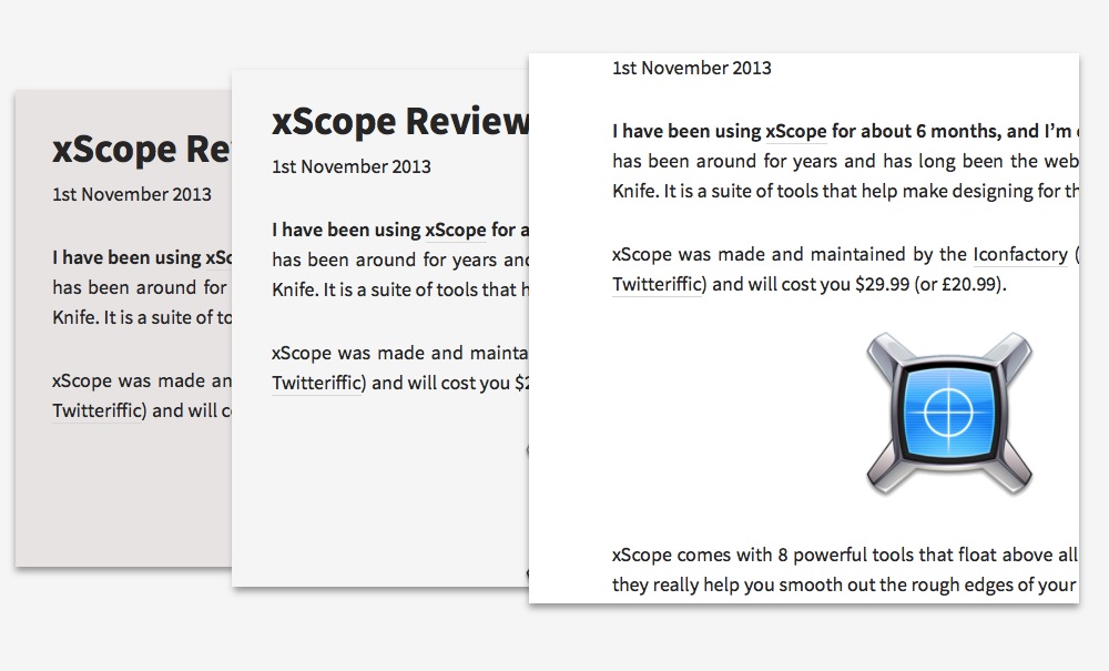
The most obvious use case for the luminosity media feature is to adapt a design depending on whether the user is reading the page during the day where ambient lighting is brighter or during the night where ambient lighting is darker. We already see this behaviour in a few native apps.

The thing about designing for the web is we don’t have the same prior knowledge of the destination device that designers for native apps do. The light sensor’s sensitivity on an iOS device might be different than an Android device, and the light sensor’s sensitivity on an Android device might be different to the light sensor of another Android device, so we would need to be careful with the degree of change we make as it could be jarring to devices that have an overly keen light sensor.
The code looks something like this:
@media (luminosity: normal) {
    body {
        background: #f5f5f5;
        color: #262626;
    }
}
@media (luminosity: dim) {
    body {
        background: #e9e4e3;
    }
}
@media (luminosity: washed) {
    body {
        background: #ffffff;
    }
}
A normal luminosity level represents the screen being viewed in ideal lighting conditions. I would recommend working from this level as your default — and rather than wrapping those styles in a media query targeted for normal luminosity levels it would probably be best to leave those styles unwrapped so browsers and devices that haven’t got the capability of seeing the luminosity media feature can see the page in it’s ideal condition. You can then use the dim value to make adjustments for darker environments and washed to adjust styles for brighter environments leaving the default styles accessible to all devices whether they are equipped with a light sensor or not.
I mentioned earlier about the potential differences in the light sensor hardware sensitivity — I think this is a key reason not to go over the top with the changes we make within luminosity media queries. Can we definitively say that a cloud passing on front of the sun will not trigger the dim luminosity media feature? The last thing I’d imagine the user wants is a harsh change between light and dark designs that is too easily triggered.

As with other facets of web design, we should strive to stay out of the user’s way when they are trying to enjoy our design. The luminosity media feature has the potential to be the most annoying media query at our disposal, it could be responsible for ushering in a new era of glow in the dark websites — let’s just be careful with it when it arrives.