The best puzzles are the ones that demand more of you. When the answer appears obvious, but you second guess yourself. When you know there’s more to it than meets the eye.
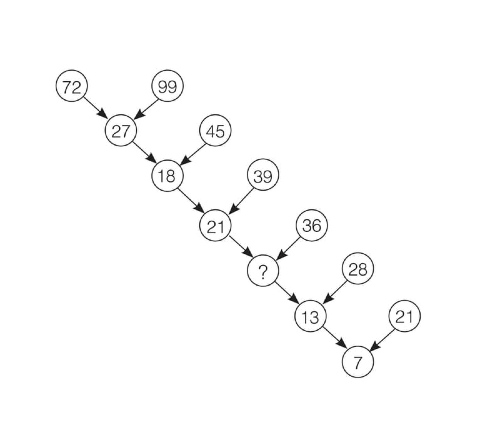
Nob Yoshigahara’s infamous number tree puzzle is certainly one of my personal favourites for just these reasons. It gives you a set of information and asks, What do you make of this?
Puzzles are a great tool for strengthening mental muscles that can help unpack design problems. They push you to adopt a different mindset and perspective, challenge assumptions, study intently, and look closely. Like a puzzle, difficult design problems evoke that same moment of epiphany when you peel back the layers to find hidden truths.
But design challenges are not quite as easy as puzzles, which have the answers hidden in plain sight. With puzzles, all the pieces are available to you: You just need to put it together. With design problems, you need to find the pieces first, then put everything together.
This can be daunting, but there are methods, tactics, and techniques you can reach for to help facilitate these discoveries.
First principles
Although used heavily in the field of physics, Aristotle’s method of reasoning known as “first principles” originated as a means for organic reasoning (as opposed to looking at analogies, which are often riddled with errors).
When applied to design problems, you start with an observation, such as a requirement in a project brief. Then you ask why until you arrive at the most basic understanding of the truth of the problem. This provides a solid foundation to build upon.
First principles force you to look at the problem without using other people’s preconceived ideas and attempts on how to solve it. When you use this approach, you automatically generate new value. It’s certainly cognitively more intense, but in my experience it produces more original and valuable results.
What happens if you arrive at the same conclusion others have already reached? Is this method a waste of time?
Mike Bithell, an independent game developer, sums this up nicely:
“Oftentimes, when trying to reinvent the wheel, you end up with a wheel. But there is a nice moment of ‘huh, I guess that’s why people just use wheels’… that process of justifying the standard is satisfying, if massively wasteful. Still. Cool wheel.”
For a good example of first principles in action, try this Wikipedia experiment. Click on the first non-parenthesized link in any random article and follow the chain. It will lead you down a path toward the most basic understanding of any concept. Strangely, approximately 80% of articles deconstructed in this manner bring you back to the Wikipedia article about philosophy.
Question everything
“Judge a man by his questions rather than by his answers.” –Voltaire
A design problem is only as difficult as the questions you ask of it.
Good questions don’t necessarily lead to definitive answers, but rather further questions. The amount of additional questions tends to correlate with the value hidden within the problem. If a question is easily snuffed out and the conversation cut short, it might not be as provocative as you originally suspected.
Some good starting points for exploratory questioning are:
Why is this a problem?
What makes you believe this is true?
What is your biggest challenge?
Who does this well?
What question did I not ask that would be valuable to know?
Feel free to use why liberally. Why is like a jackhammer for drilling through a problem’s layers. Why is flexible enough to get to the basic fundamentals (see: first principles), but can also be used to dig deeper into the problem you’re facing.
Sometimes, the best follow-up question is no question at all. A tactical silence can encourage your client to fill in the gap and reveal additional knowledge that might have otherwise been overlooked.
Collaborative understanding
Your strength as a product designer is determined by your ability to provide valuable solutions that address your client’s business goals and objectives. This can only be achieved if you deeply understand the original problem.
I find it beneficial to collaborate intensely with the client to define the problem(s) you’re going to address. Don’t take the version defined in the brief as the be all, end all. Explore it completely, break it down to first principles, build it back up, and communicate the problem back to the client.
This demonstrates your understanding of your client’s problems, your ability to grapple with problems, and your client’s understanding of their own problems. It creates a good starting point, and it’s the perfect time to demonstrate exactly how you’re going to test assumptions and measure success.
“A design lives and dies by its designer’s understanding of the problem. Understand the problem.” –Jared Erondu
A few more back-pocket methods
There are always more ways to test your solutions.
For example, Occam’s Razor is a mental model that suggests that the simplest solution—the path of least resistance—tends to be the right one. Although it isn’t always indicative of the truth, it’s a good technique to help avoid assumptions and analogies.
It’s also worth implementing techniques that help remove biases and ensure objectivity. One of my particular favourites is “steelmanning,” or building the strongest possible counter-argument to your solution. Adopting both for- and against-mindsets as you pursue a solution is hugely valuable; it not only produces a better solution, but arms you with a defence against the alternative.
The path to delivering value in product design isn’t through shiny user interfaces. Like a good puzzle, it lies in your ability to approach the problem from an inquisitive perspective, assemble the pieces of information you need, explore fundamentals and truths, and build back up to the definitive solution.
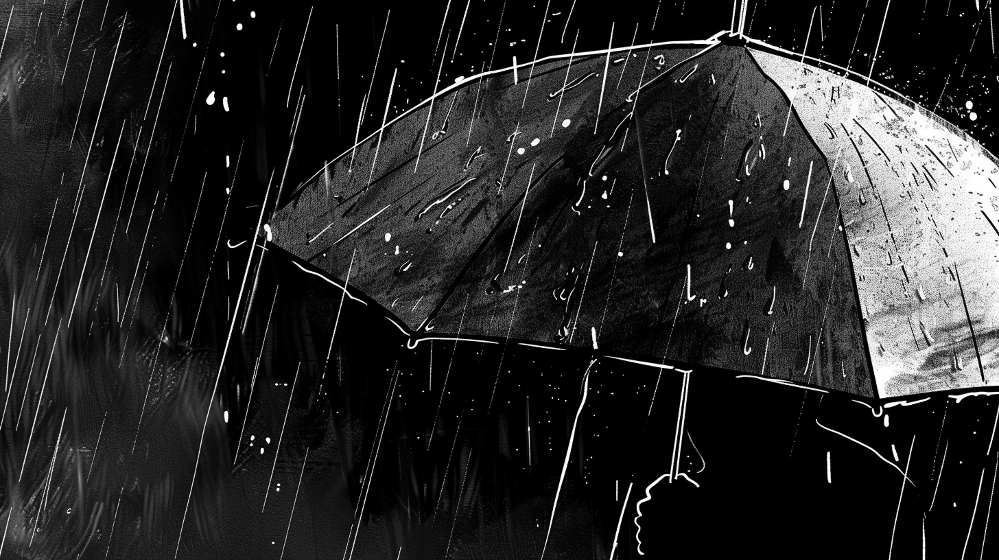
Living in Ireland I have become accustomed to rain as our weather system’s default setting. Umbrellas are dispensable in the Moore family as wind and rain have proved too worthy an opponent for many a shelter device across varying price brackets. When Managing Director of Their Capital, Eric Weinstein, spoke to Tim Ferris about the lack of innovation in umbrella design, hinting that the answer might be in Origami or perhaps nature, my interest piqued and sent me down a rabbit hole.
The rabbit hole confirmed my suspicions that we borrow from nature all the time, particularly in physical product design. The borrowing is often conscious, and sometimes we arrive at the same conclusions for problems that nature has been resolving over vast periods of time. Initially, I took Eric’s challenge on as a thought experiment, and like any good thought experiment, I got lost down an avenue leading to ideas beyond the original scope - even completely separate to the original problem. Distractions like this excite me. I enjoy seeing how deep the rabbit hole goes particularly when the journey is peppered with little epiphanies along the way - a process I call “mining for truths” much to the groans of anyone around me when I verbalise this process.
Evolution: nature’s R&D department
“You could look at nature as being a catalogue of products all of which have benefitted from a 3.8 billion year research and development period”1.
Michael Pawlyn, Using Nature’s Genius in Architecture
Nature’s creations are rooted in purpose. Look around your natural environment and you’ll observe that everything that exists for a specific reason, purpose or function for the benefit of something else within the broader system, and quite likely that entity is good at the thing it is supposed to do. Now look around at human creation on the other hand. You don’t need to look any further than architecture to find that in the vast majority of cases - particularly in inner cities filled with office blocks, the environment crafted by human hands go beyond purpose towards posturing and signalling power and money. Expensive materials serve the purpose of looking expensive compared to nature’s purpose-driven habitats. You might be thinking, “So what?”, “What’s the point in worrying about it?” I’m just observing the fact that nature out-designs us as it has figured out its “why” and is pursuing iterations upon its user-tested design.
Let’s look at a very basic example. Nature might look at a honey bee as its persona (nature needs personas to divide audiences as job stories would provide the same outcome for rabbits and other animals outside of scope. I’m half-joking). The bee’s motivations are to make honey, but it’s a secondary goal beyond its nectar and pollen collecting duties. It has a penchant for bright colours. The plants know this too. Their motivations are to reproduce and they require the honey bee to transfer pollen and spread. So nature designs brightly coloured plants full of delicious nectar with pollen that sticks to the honey bee’s limbs (there is some sort of cookie/tracker metaphor here) and pollination occurs when coming into contact with another plant. Mutual survival goals are met through an evolutionary purpose-driven design process.
Taking into consideration the fact that nature designs with ridiculously long-term goals in mind that benefit the greater whole with system-wide collaborative design decisions, it’s probably worth asking the same of our approach to digital projects.
Biomimicry
The act of borrowing ideas from nature has been recently dubbed “biomimicry”. According to biomimicry.org2:
Biomimicry is an approach to innovation that seeks sustainable solutions to human challenges by emulating nature’s time-tested patterns and strategies.
Examples of biomimicry in mechanics include the Shinkansen Bullet Train, the world’s fastest train at 200 miles per hour. If the Shinkansen Bullet Train was built in the form of traditional trains, it would have created thunderclaps when exiting tunnels due to the sheer speed of the machine. To counteract this unfortunate side-effect, the engineers looked towards the beak of a kingfisher.
“This shape has enabled the new 500-series to reduce air pressure by 30% and electricity use by 15%, even though speeds have increased by 10% over the former series. Another benefit has been confirmed through a favourable reputation among customers that these trains give a comfortable ride. This is due to the fact that changes in pressure when the trains enter tunnels are smaller.”
(Kobayashi: 2005)
NASA has several biomimicry projects in development including bio-inspired exercise equipment helping astronauts maintain fitness during spaceflight, solar propulsion mechanisms and glider technology inspired by a seagull’s wingspan that saves on the need for continuous thrust and fuel costs.
Beyond physical features, certain characteristics of digital systems can be found in nature. The internet bears striking similarities with fungal bio-systems in regards to how they pass information and exchange nutrients3. It isn’t clear whether the nature of the web was a result of learning from nature itself, or a case of humans and nature reaching the same conclusion, or a complete coincidence, but noteworthy nonetheless that there are potentially many metaphors we can call upon from 3.8 billion years of evolution.
What can we learn from it in digital product design?
Here’s the kicker: digital design virtually rules out all physical aspects of lessons from nature. The adaptability of our screens in being able to display images, text, art, film, games - that open range of uses is its downfall when looking for like clues in nature. Where does nature project images onto a surface as a means of guiding a subject? We could point towards the fact that birds can visualise elements of the earth’s magnetic fields to aid migration flight paths, or that bats and dolphins make use of sonar to sense the environment around them as wayfinding techniques, but that’s not going to be any useful model for a human in any sort of meaningful way.
In addition to that, I think we’ve been down the skeuomorphic route before in regards to the affordance of digital things where past visual cues inform the use of interface elements within new contexts. Maybe we threw the baby out with the bathwater on that one. Ditching skeuomorphism for a flatter, “purer”, native digital user interfaces seems more like a stylistic decision rather than one that is overly beneficial considering we’ve torn out a massive but hard to quantify familiarity and meaning piece between user and interface. Nature didn’t have a major role to play in such interfaces, even though I would have liked to explore how certain instincts such as fire = burn, snake = fear and prickly surfaces = stingy. Then there is a measuring exercise in seeing how effective these visual cues are over time when the suggested texture doesn’t provide the expected touch feedback as all current touchscreen glass produces the same feeling. If texture’s function in nature is to provide useful function, it certainly doesn’t have any functional application in digital products beyond visual cues.
Apart from animal instincts, natural systems and textures beyond our emulation capabilities, perhaps there are deeper truths within nature that do resonate with humans. What fundamental laws of nature act as guiding rulesets to allow design to emerge and iterate upon itself through evolutionary processes to give some sort of significance in the eyes of humans?
All of a sudden this little rabbit hole is getting a bit deep and asking challenging questions that I am certainly not qualified to definitively answer, but I do have some observations. There are two universal laws (and I’ll use the word “law” loosely here) that improve design and that evolution has deemed worthy of keeping over time.
The Pareto Principle
The Italian economist Vilfredo Pareto stated in his first published paper in 1896 that approximately 80% of the land in Italy was owned by 20% of the population. One of the common axioms of business management is that 80% of the work comes from 20% of your clients as demonstrated by Richard Koch in his book the 80/20 Principle (an alias for the Pareto Principle). Some attribute this observation back to Biblical times, specifically Matthew 25:29 where it reads: “For unto every one that hath shall be given, and he shall have abundance: but from him that hath not shall be taken away even that which he hath.” This seems to align with the with the observation that the richest 20% of the world’s population controls just shy of 83% of the world’s income4.
The basic structure of a Pareto statement is that 80% of the effects originate from 20% of the causes.
It’s a useful lens to look at everyday things in your life, your work and even your design decisions. For example, 20% of project effort in building out a design system might cater for 80% of the interface decisions required. 80% of the value you deliver in a particular project might come from 20% of the product.
I’ve had conflicting thoughts as to whether to include the Pareto Principle as part of this article. It appears to be a law that transcends time, culture and government pointing it towards being categorised as a Natural Law but the majority of its examples (some of which covered below) seem to reveal more about the nature of human influence rather than Nature itself. I lean towards the notion that the Pareto Principle is an observation rather than a law of nature5, and there is a nuanced difference between Nature and what constitutes a natural law, so it would be rather clumsy to conflate the two without pointing out this discrepancy. That isn’t to say that the Pareto Principle as an observation isn’t true, it’s a consistency that seems to house a deeper truth about human nature which will at least have its uses rather than discounting it as part of the discussion.
Fibonacci and the Golden Ratio
Let’s start with the obvious one - this seemingly universal rule appears out of mathematics, the much-dubbed language of the universe.
The Fibonacci sequence was introduced in the Italian mathematician Fibonacci’s book Liber Abaci (Book of Calculation) as a means for solving a problem regarding the growth of rabbit populations based upon ideal conditions (a boy and a girl born at each birth). The sequence of numbers from the solution became known as Fibonacci numbers. As these numbers grow the ratio between two adjacent terms resolves neatly at 1.618, also known as the Golden Mean, the Golden Ratio, Phi or the Divine Proportion.
This measurement exists throughout nature, from small scales such as the arrangement of sunflower seed heads, the fractal-like spirals of seashells, to larger scales such as the breaking waves of the ocean to the dizzyingly large proportions of spiral arms of galaxies. More immediately, these measurements appear throughout the human body between joints, the proportions of the eyes, nose and mouth on the human face - these eerily omnipresent ratios permeate nature and appear to indicate some sort of universal beauty and truth that speaks to human observers.
Artists such as Leonardo Da Vinci and Salvador Dali have utilised this rule in their works. Da Vinci was a close personal friend of Luca Pacioli, author of Divina Proportione, a three-volume treatise on the Golden Ratio in 1509. Was this friendship the source of Da Vinci’s implementation of the rule in his paintings? Whether he did or did not utilise the Golden Ratio to paint the Mona Lisa or consciously employ it in the Last Supper is subject to much debate. The Vitruvian Man however clearly illustrates Da Vinci’s fascination and understanding of the phenomenon which appears to predate both the Mona Lisa and the Last Supper, make of that what you will.
There have been experiments in digital design to utilise the Golden Ratio. This seemingly algorithmic property of nature feels like a good candidate for systematisation on mathematically-based platforms. When Tim Brown introduced his Modular Scale at Belfast’s Build Conference in 2010 I was struck by his emphasis on meaning when defining harmonious typographic scales. Here Tim presented a replicable formula (1:1.618) and adapted it for a medium beyond Greek architecture and growth patterns in plants resulting in a series of numbers that when applied produced harmonious digital typographic hierarchies and layouts.
Tim’s talk had such a profound effect on my work that I threw out my old methods of picking numbers out of the air for things like element widths, font sizes and vertical rhythms and instead explored a more meaningful set of measurements true to nature, born out of maths, the language of the universe.
Back to traditional art for a moment. One of my favourite paintings is Salvador Dali’s 1955 piece The Sacrament of the Last Supper. It is by far the lesser known of the two famous Last Supper paintings, and like Da Vinci’s, Dali unapologetically employs the Golden Ratio in the altar that dominates the centrepiece of this remarkable union of religious imagery and surrealism. Here Dali had a reproducible algorithm for beauty, harnessed from nature, communicated back through his medium, the canvas, stirring the soul through the eyes of the viewer.
Constellation
Brian Moriarty is one of my heroes in the gaming industry. He is best known for adventure games such as Loom and The Dig as well as his infamous lecture “The Secret of Psalm 46” which has been adapted into a dramatic production, a graphic novel and plays a role in my favourite video game, The Witness (no spoilers here, sorry).
In another one of his lectures titled “Who Buried Paul?”, a deep dive into the Paul McCartney death hoax, he outlined human propensity for projecting meaning and significance where there is none. Moriarty points out that seemingly meaningless artefacts in Beatles album art led fans to believe that the band were trying to tell them of the death of their friend and bandmate Paul through a series of clues such as the floral arrangement on the Sgt. Pepper’s Lonely Hearts Club cover that appears to spell “Paul?”. Also, the backwards messages that seem to say “Turn me on dead man”, and “Paul is dead man, miss him, miss him”.
“Humans project meaning and significance where there is none, particularly in cases where none exists. The meanings we expect to see. The significance we WANT to see. Constellation is a form of self-recognition.”
Moriarty calls this phenomenon “constellation”, a human desire to see patterns and make connections between points. Looking up to the stars in the night sky, our ancestors created many images through self-recognition and seeing meaning and significance between points of light across a dark expanse. These connections appear to be stimulated where novelty exists rather than manifesting from the mundane. Look at the Beatles For Sale album cover juxtaposed with the Sgt. Pepper’s Lonely Hearts Club artwork. One generated meaning and a multitude of interpretations in the eye of the beholder where the other just framed four guys from Liverpool ready to sing a few songs for you, the listener.
So how does constellation, or the act of constellating help us design better digital products? Firstly your product needs to serve a purpose beyond a utility, particularly if that purpose leads to meaning or reveals greater truths. Constellating is a quick means to meaning, what red herrings give rise to speculation and new interpretations? Why do some of the great films such as Donny Darko leave parts of the story untold? People fill in the gaps with personal significance which means that somewhat counterintuitively, incompleteness by design encourages constellation which creates greater personal meaning rather than pre-prescribed, one-size-fits-all meaning.
Conclusions
Nature is our outsourced research and development department. Observing problems solved by nature can help inform how we approach problems in digital design. Nature doesn’t like arbitrary features. It finds a way to shed unnecessary elements in advancing long-term goals over vast systems.
Biomimicry is a lens through which to learn from nature as well as build purposeful things. Beyond physical features, nature appears to hold a series of deep truths that evoke some sort of meaning in humans. The Golden Ratio, the Pareto Principle, affordance, constellation, intention - design with these tools and you are using frameworks built upon deep human and universal truths encoded into nature.
A Tweet from Steven Hylands caught my attention and got me thinking about my outlook on the digital design landscape, or more specifically my approach to learning new things in this space.
I have spent the last year or so avoiding any sources of design news aggregators including dedicated sites, Twitter accounts and various Medium publications. It wasn’t an overly conscious decision, it just sort of happened that I fell out of the loop, realised later that I fell out of the loop and then decided it wasn’t a loop I was interested in getting back into.
My honest opinion is that I don’t feel like I’d miss any monumental leaps in our industry if I stopped checking design news or missed out on some new framework or build tool.
There are of course things worth your time and deep consideration, and there are distractions. Profound new thinking and movements within our industry - the kind that fundamentally shifts the way we work in a positive new direction are worth your time and attention. Other things are distractions. I put new industry gossip, frameworks, software and tools firmly in the distractions category. This is the sort of content that exists in the padding between big movements. It’s the kind of stuff that doesn’t break new ground and it doesn’t make or break your ability to do your job.
Here is an over-simplified timeline of the industry movements that I have witnessed:
These are the big fundamental leaps in how we make and how we have made things and lots of time in between them. If you have been in the industry during any of these movements, it was hard to miss any one of them. My reassuring message is that the important stuff finds you.
New tools2, software, frameworks and hot takes on design matters dominate feed aggregators and I secretly think a lot of authors consciously utilise FOMO - not in the sense that you’re missing out on something important, but the idea that you’ll fall behind in how to do your job. This is simply not true.
A side note on future design jobs
The truth is if you dedicate yourself to keeping up with these tools, or worse, dedicating yourself to specialising in them, you will be replaced by the next thing. In fact, when design becomes so formulaic that it paves the way for automation and then for artificially intelligent design unless you bring something innately human to the table, you too will be replaced.
Nothing about that concerns me though. You could spend your time trying to fight the machines (the systems, the automation, the artificial intelligence) but the reality is that it works faster than you, it works harder than you and it’s going to be cheaper than you. It’s a pointless fight. Choose instead a different battlefield - one that isn’t about low-value, replaceable design and that is about high-value problem solving for deep human needs.
Structured serendipity
I used to feel bad for not keeping up with design matters. My interests drifted towards big, broad topics that I have spent my life avoiding such as psychology, philosophy and economics. I am consuming a lot of material across each of these topics and many others in my personal time, not for any other reason other than a quest for knowledge. I’m nowhere near an expert or a beginner for that matter in any of the aforementioned topics, but what I did start to notice over time was that I was finding concepts from these completely separate fields started manifesting in my design work.
Jason Zweig, a journalist for the Wall Street Journal wrote about varying what you learn and varying where you learn it:
New associations often leap out of the air at me this way. More intriguing, others seem to form covertly and lie in wait for the opportune moment when they can click into place. I do not try to force these associations out into the open; they are like the shrinking mimosa plants that crumple if you touch them but bloom if you leave them alone.
Serendipity is a human concept that can’t/won’t be easily replicable by machines. Exploring new ground outside of our industry is fuel for serendipity, and thankfully my interests beyond acquiring new design knowledge are proving very useful in that regard.
My industry fatigue didn’t reveal itself through my work (I actually enjoy what I do a lot). It came about because I felt that there wasn’t anything new to learn within the field. Purposefully branching out into other fields has got me excited about designing with new perspectives on things and different approaches from beyond our bubble. I can’t say that I miss industry news… I actually feel like a better designer because of the choice to consciously sidestep it.
Just give me a nudge when the next big movement happens, okay?
The Big Five Personality Traits, sometimes referred to as the five factor model (FFM), is a model commonly used by psychologists to describe individual personalities. The original model was constructed by Ernest Tupes and Raymond Christal in 19611 but it didn’t reach mainstream academic audiences until the 1980s and early 90s.
Multiple sets of independent researchers on human personality arrived at the same conclusion in naming the five factors that generally predict and explain behaviour which indicates the factors are valid as far as we know today.
Each of the five factors (O,C,E,A,N) are scored between 1-100 according to the individual ranked against average scores after completing a series of questions (try it out for yourself).
The five factors are:
Openness - this trait describes someone’s appreciation for art, adventure, inventiveness, creativity, sensitivity to beauty, likely to hold unconventional beliefs - things of an abstract nature. I personally sit on the 95th percentile for openness which seems abnormally high, but most people in the design industry tend to rank quite highly in this factor
Conscientiousness - a sense of self-discipline, desire for achievement, tendency to defy measures impeding the route to success, orderly, attention to detail
Extraversion - mostly describes what kind of social animal you are, the ability to start conversations, talking to a variety of people at a party, ability to assert themselves, extraverts rather than introverts
Agreeableness - sensitivity towards others, empathy for the emotions of others, interested in people and the desire to make people feel at ease, giving up time for others, kind, generous, trusting, optimistic about the intentions of others
Neuroticism - negative emotions such as anger, anxiety, depression, easily stressed and irritated, worrying, prone to mood swings
Every person maps differently to each of the OCEAN personality traits, and having an understanding of how others around you correlate is beneficial to your interactions with them. Not everybody is comfortable being open about the specific scores on each of the factors, particularly as some indicate socially negative traits such as anxiety and depression. Before co-founding our product design studio, each of the directors took the Big Five Personality test as a means to a) see how aligned/unaligned we were in our own individual personalities and b) as a means of empathising with each other in recognising our strengths and supporting our weaknesses. I understand that not everybody would be comfortable sharing something that is so personal to the individual, but we found this exercise has eradicated any talk of “I don’t understand [person]’s point of view” and “I don’t get where [person] coming from”.
The Persona Conundrum
For me, the tools and methodologies within the field of user experience are flawed in that they do not address concerns beneath a user group level. A truly meaningful experience would speak to the individual rather than taking a one-size-fits-all blanket approach.
We are great at understanding the needs and desires of groups of people, but even personas - the UX tool designed to help empathise with specific users - always bring us back into solutions that scale up to cater for groups based on the assumed needs of a single user. Designing an experience for Sarah, a junior shop assistant who likes long walks, often leads that the majority of users become Sarah and her intended experience is their experience. Job Stories are a relatively new entry into this space where they fix the problem of personas splitting audiences, getting in the way of shared goals. Job Stories are a good means of orienting towards tasks and for that reason remain compatible with an OCEAN approach to UX where Job Stories address universal functional requirements. It leaves room for a presentational layer and certain functional elements catered for individuals.
Practical Applications
Applications could adapt their interfaces to individuals. Let’s imagine a fitness app with a audio guided run feature. Users in the upper percentiles of conscientiousness may benefit from the orderly, disciplined commands of a drill sergeant and from an app that stretches their goals slightly beyond their comfort zone pushing the user to compete at their best. For people on the other end of the conscientiousness scale, a softer approach would be necessary along with positive reinforcement to help them be the best that they can be without pushing them into territory that alienates them or makes them feel inadequate.
The same could apply for language and labels used within interfaces. Perhaps some colours appeal to certain personalities? Maybe there are images that intimidate people that inspire other sets of people?
Looking at the differences between individuals along OCEAN factors studies have shown that individuals high in agreeableness (people who give up time for others, make people feel at ease) are less likely to negotiate salary increases within their company. Perhaps we can create applications that help people move towards desired outcomes in adjusting elements in their personality that may be impeding on particular life goals.
Potential dangers and opportunities
One of the biggest challenges in pursuing this untapped area of UX is gathering the data required to determine a person’s scores along the Big Five Personality Traits. It’s not exactly ideal to have users answer a full personality test under the promise of a better user experience on the other side of this unique onboarding experience, and it’s certainly not ideal to gather this data in any way that negatively affects a user’s privacy. Maybe it’s something that happens over time where certain actions can produce a score against the OCEAN factors, or games, puzzles and quizzes may unlock this type of information. There is work to be done and design problems to figure out here.
Then there’s the question of how you store this information and what exactly you do with it. I don’t believe it is necessary to store this data on servers or let any company see a user’s scores. That is for the individual to know and for the product experience to react to it. It is potentially dangerous territory, but then again, so is everything we do:
If ethics is about the question of how to act, and designers help to shape how technologies mediate action, designing should be considered ‘ethics by other means.’
Every technological artefact that is used will mediate human actions, and every act of design, therefore, helps to constitute moral practices.
In other words, every design decision you make is loaded with your intent and bias. We’re already knee deep in the danger game whether you have realised this sobering fact already or not. Another one of the major challenges is engineering objectivity into this process, and whether this field is explored further or not, we should look to engineer objectivity into our work regardless.
What next?
I’m at the mystery stage of the knowledge funnel as described by Roger Martin in his 2009 book The Design of Business3. I have identified that this is an area with great potential and the next steps are to build heuristics to see if we can mine the mystery for insights with the eventual hope of turning the research into a reliable, replicable algorithm give us the capability to create and resonate with the people who use the things we make.
Writing my to-do list for the day is a key part of my morning routine and essential to state setting and priming. Before I have a chance to get distracted by emails and other notifications vying for my attention I sit down with my morning coffee and write down the tasks I want to complete for the day.
I use elements from Ryder Carroll’s Bullet Journal to list out today’s tasks. Each task starts with a bullet point followed by a short description of the task. When completed the bullet point is crossed out so it changes from “•” to “×”. If I didn’t finish a task and I still consider it to be a valuable thing to do I move it to tomorrow’s list by replacing the bullet point with “>” indicating that the task has been deferred.
If the task is delegated or can be deleted from the list before starting, then it gets a nice, satisfying line through it. Using this system means that when reviewing my list at the end of the day I get a quick visual reference ensuring every bulleted task has been in some way and nothing slips through the net.
You can go deeper with Bullet Journalling using tools like the Ryder’s Future Log for planning goals for the month, but I found that in practice navigating between pages became more frustrating than helpful. I found the most value in the daily task management part of the system so I have no qualms about utilising only that part of the Bullet Journal methodology.
So why not software?
One of biggest advantages is where it falls short for me in managing daily tasks. Software is faster than pen and paper. It’s easy to create a new task and add it to your list, which makes it easy to fill your list with things to do without a chance to properly think through the value of each task. I have been through countless task manager and to-do list tools to find one that sticks but in the end, I have always come back to pen and paper.
Unlike a physical book, has to compete for your attention amongst other open apps, windows and browser tabs. I remember using a popular app based on the Getting Things Done (GTD) methodology and thinking it was working for me as I logged numerous tasks rapidly and proceeded to get to work. However, the problem started as soon as I started working on the tasks I had just set myself. The app would be hidden under multiple windows and sometimes I would go for days before realising it was still open with old, irrelevant tasks (and some forgotten items).
Such apps allow you to set due dates and notifications, but I find they take me out of my current flow and I end up working the app rather than the app working for me. You don’t want to end up in a situation where you have to bend to fit the opinions of an app - what happens if you decide to change your to-do writing style or system? The software probably wants you to do it a certain way.
Why pen and paper?
The great thing about pen and paper is its inefficiency. It takes time to write the list, and that’s the beauty of it! Editing is clunky and it gets annoying when you have to rewrite tasks that you need to move from day to day. For that reason, it encourages taking time to write better, more realistic goals. is too forgiving in that regard, pen and paper hold you more accountable and it promotes thinking through big tasks and breaking them down into achievable subtasks that can be done today.
Using a good old fashioned notebook has the additional advantage of taking your eyes off the screen. That pause enforces a small step back and seeing the bigger picture. It’s therapeutic.
My Instapaper feed looks a lot like my Steam account. I have gathered many items with the good intention of making use of them on a rainy day, but they eventually gather dust on their virtual shelves.
Occasionally I’ll try and blast through a set of articles that I considered at one point to have potential value to me. When I’m strapped for time I’ll try Instapaper’s “speak” feature, which is effectively a shortcut to iOS’ dictation feature. I usually end up cancelling the dictation after it reads a few paragraphs. Perhaps I forget how bad it is or maybe I’m expecting some advances in the technology since I last used it that make it sound more natural and human-like.
With AI being applied to more and more tasks, fields and entire industries I notice how far it falls short of key human traits such as empathy and storytelling, and empathy within storytelling for that matter. We have thousands of years of experience on the robots when it comes to communicating oral wisdom from campfires and passing ideas down through generations.
AI narration is improving, however, services like Narro offer bots with various dialects that have fairly accurate speech patterns and rhythm. But ultimately the narration ends up having a passive effect as AI hasn’t managed to emulate the human capability of captivating an audience to deliver a message. Robots rely on punctuation like a musical score to inform the pace at which they communicate text, though we lack punctuation for instinctive human storytelling tools like drama and the pause to allow certain ideas to simmer in the minds of the listener. This is why uninteresting speakers often fail to communicate their idea — the audience becomes disengaged from the message.
On a relevant note, another key human trait in storytelling is context. With a contextual understanding of the topic, humans know when to employ the storytelling tools mentioned previously. Consider this example from a recent opinion piece in the New York Times about the dangers of relying on Google rather than investing in deep understanding:
Google is good at finding information, but the brain beats it in two essential ways. Champions of Google underestimate how much the meaning of words and sentences changes with context. Consider vocabulary. Every teacher knows that a sixth grader, armed with a thesaurus, will often submit a paper studded with words used in not-quite-correct ways, like the student who looked up “meticulous,” saw it meant “very careful,” and wrote “I was meticulous when I fell off the cliff.”
A classic example of schoolchildren discovering a tool like a thesaurus and employing the technology incorrectly. With AI dictation we are cutting out the middleman leaving it open for potential missteps like this not necessarily with words, but the in the power of those words.
P.S If you are looking for a startup idea, please feel free to design a subscription service with great human storytellers willing to read my Instapaper feed for me, thanks!
Looking back over the vast majority of user testing sessions I have conducted, I noticed a pattern in where I felt I got the most value from each individual session.
I’m talking about the moment where the room is silent and there’s that awkward pause where the user is struggling and everything in your being is telling you to help them. It’s the moment in the session when they’ve been struck by genuine confusion that causes a gap in the person articulating thoughts back to you as they move through the prototype. If you cave and give into your inherent human desire to help then you risk losing highly valuable insights. You’ll know that moment is happening because you’ll feel it in your gut. You’ll see the obvious on screen where the person sees something else. You’ll see it in their eyes and you’ll want to help by telling them the answer or even ask them something like “What did you expect to happen here?”
Exercise restraint and give that moment time to breathe.
Wait for the silence to become uncomfortable and then keep waiting. If you speak first, you lose. Whatever they say first will be an insight. Even if it’s simply “I’m stuck…” or an “I don’t know what to do here…” that gives you a foundation upon which to build a line of questioning to dig deeper. Or they’ll tell you the answer and it will be gold.
Another thing that I’ve noticed is that after that moment in the session it’s generally the point at which the person loosens up a bit more and talks more candidly about their thought process and becomes more openly critical about your work. For me, this is what defines a useful user testing session versus a session resulting in a blank page with a lack of insights. Otherwise, we could end up going through the motions in a session where you both know the person isn’t being entirely honest because they don’t want to offend people and you end up receiving low-quality feedback, or some of the feedback simply isn’t communicated because that barrier hasn’t been removed.
I believe it’s still important to lay the groundwork in making them feel at ease, like reassuring them that you didn’t design this thing and that it was the team back in the office (even though you totally designed it), and the fact that you’re helping us make this thing better (which is true) — it’s in that moment of awkwardness where they struggle and you exercise restraint — that’s where the real value lies.
Christian Bale famously lost 63lbs for the role of insomniac Trevor Reznik in Brad Anderson’s psychological thriller The Machinist. Bale’s disturbing body transformation happened over the course of 4 months during which he forced himself into a diet of a can of tuna and an apple per day, keeping himself isolated for prolonged periods of time and going without proper rest. His dedication to the role before filming even began is a common reference point for people describing method acting.
Method acting is a technique derived from Constantin Stanislavski, a Russian actor and theatre director who between 1911 and 1916 used a methodology to train actors in the quest for theatrical truth. In essence the goals of Stanislavski’s System were to portray actors on stage as natural, believable characters. To achieve these goals actors would rely on recalling emotional memories and past experiences to bring those feelings to the role they had to portray. Actors would also use “If” (often refered to as the “Magic If”) to answer the question “What would I do if I was in this situation?” by envisioning themselves in the characters situation.
Like Christian Bale, many actors in the film industry such as Anne Hathaway, Robert De Niro and Joaquin Pheonix employ the modern day interpretation of Stanislavski’s System — method acting. The method starts before filming giving the actor time to plan and prepare for the role leaving them better equipped to deliver a stronger performance during filming with a relatable, believable character.
Don’t think that I’m suggesting that we as designers for the Web take on extreme diets or the kind of psychological experimentation that could be potentially damaging without professional advice. I can’t help but admire the lengths method actors go to for their art. Perhaps we can learn from the emotional investment they make to a role before production begins. Isn’t that the whole point of UX research? We throw the word “empathy” around boardrooms and company about pages to show that we care about the people we are making the product for. To me, empathy has become an empty promise - a buzzword to appease potential clients.
To be truly empathetic I believe it involves going further than a few demographically informed personas that we assume are going to represent real people who use the things we make. Think about the project you’re working on now - how much of a difference would it make if you lived as the person you are making this for? How would they feel using the product? Where does it fit in their everyday lives? My hunch is that we would be able to make more well informed decisions that resonate with those people by diving right into the role, then we would have better tools to answer “What would I do if I was in this situation?”
There is no doubt that with this approach it can be emotionally taxing. There’s a balance and a scale in regards to how far you pursue it.
After filming of The Machinist wrapped up Christian Bale’s next role was Bruce Wayne in Batman Begins. He gained 100lbs in six months and started rigourously learning martial arts for the many tightly choreographed fight sequences in the film.
Before I made the leap I read blog articles of other freelancers who did the same. People like Stuart Robson, Chris Allwood, people who have made it work. I also called a lot of people - Chris Armstrong, Chris Murphy, Andrew Fulton - without their advice I probably would have talked myself out of it because before you actually do it your mind finds plenty of reasons not to do it.
To cut to the chase: it’s working for me too, and I want to give that reassurance to people are considering making a similar move that it can work for you.
I thought I’d start by discussing a few of the worries I had after I handed in my notice:
What if there isn’t enough work out there?
What about all that paperwork?
Running my own business sounds scary
Firstly there is always work out there. This comes from a place of reassurance rather than any sort of attempt at bragging but my diary has been full since I began. I haven’t needed to advertise my services,apart from the initial announcement in March that I was going freelance. Since then I’ve found traditional word of mouth is still the most effective form of advertising.
The best way to let word of mouth do the work for you is to turn up every day and do the best job you can do. One of the biggest differences between agency and freelance work is that in an agency environment I would plan out how the next day or in some cases how the next week would look. Now that I work for myself I need to know what the next 3 months look like to ensure the pipeline is healthy and that I can continue to work for a variety of different people on different design problems.
Paperwork was strangely my biggest worry. I’ve never owned a business, I’ve produced invoices and estimates before in both of my previous agencies, but not for my own business. I worried that there might have been other paperwork that I hadn’t been exposed to before and that perhaps the amount of paperwork would have been overwhelming.
Luckily clever companies have been solving this problem. I bought a subscription to FreeAgent which handles my accounts including estimates, changing estimates into invoices, sending out invoice reminders, it keeps everything in check for things like tax returns and expenses. Without it, I’d be putting so much more time into this side of the business rather than concentrating on the fun, rewarding stuff.
One of the most exciting aspects of working for myself has been applying the knowledge I’ve gained after over 7 years of industry experience. I’ve learned from some great people like Paul May how could apply analytical thinking to design problems and could lead effective workshops with stakeholders and get the most out of people’s time. I’ve learned from Paul McKeever’s ability to find, create and deliver value for users and clients alike, and I’ve also borrowed heavily from Jamie Neely’s design theory and reasoning to ensure everything I make serves a purpose and fulfills a need.
By observing and working with great people, it’s easier to deliver great work.
The same is true today, if I take on a project where I know someone can specialise on a particular component, I have the flexibility to hire people in and apply their skills. Working with be best helps you keep performing to your best.
Aside from the work itself I have adapted to the freelance lifestyle pretty quickly. I have taken the time to study when I’m most productive and shape my working day around those hours. This means I know when I can do my best work rather than working within a set period of hours that the rest of a team works within.
That flexibility extends to the working environment. If I’m bored of working at my desk I can take my office with me to somewhere else like a coffee shop, or another studio, the library - wherever I want to work.
I’ve even worked a few evenings during my summer holidays - I wouldn’t recommend it for most people if you want to unwind, but I rather enjoy the novelty of working in a different country on the same projects I’ve been working on from home. It means the holidays themselves can be more flexible too - next year I’m considering working from the US for a couple of months and making the most of the school holidays with my family.
The last point I want to make is the most important factor in my decision to go freelance. I went from seeing my kids for 1-2 hours a day to being able to drop them to school, pick them up from school, attend sports days, I’ve been able to be there. That’s the kind of freedom that I enjoy most aside from all the other benefits. I can watch my young family grow up much more closely than I have before, and the best part is they don’t grow up so fast anymore because I’m there to see so more of it and spend time with them. It’s our most precious commodity and now I can shape my time to fit however I want rather than being told how to spend it.
I am delighted to announce that after 7 years working in web agencies I have decided to leave and start a new adventure as a freelance web designer.
Since I joined Front in 2008 midway through my final year of university, I have spent the last 7 years honing my craft specialising in responsive web design, user experience as well as front end and Expression Engine development. I believe that being part of the team with Front (now known as Typecast) and Eyekiller has equipped me with the skills required to manage my own destiny and seek new and exciting projects.
Working and collaborating closely with clients of all different shapes and sizes from various sectors including the BBC, Firefly and TextHelp and has been a truly invaluable experience. I’ll miss working with my fantastic clients - it has been a priviledge working together with each and every one of you to make useful, meaningful things for the web.
And of course I will miss working alongside the wonderful team at Eyekiller. I have made many friends since I joined in 2012. My last day is just under a month away on April 1st 2015. If you have any projects you would like to discuss with me, please feel free to get in touch!


