I don’t usually keep my cards close my chest, but I was very excited about building a little web app to counter the recent, and in my opinion, misinformed talk of the importance of “the fold” in web pages.
I’m not going to get the opportunity to build this thing any time soon so please feel free to take the idea and run with it because I’d love to see it come to life rather than sink into the abyss of my Someday list.
The idea
A one page website that saves the height of the user’s viewport on page load to a database, draws a line at this value (in the form of an HTML element — a 1px high div will do) and that’s it.
The cool part is that it will show you the lines drawn by every user to have visited that page1.
That’ll prove in a nice visual way if there is such a thing as the common fold, let’s leave it up to science!
Added fun
Feel free to ditch this part. I thought about a tongue in cheek Spartacus analogy calling the app “I am the Fold” with a searchable Twitter hashtag #iamthefold which would show a list of Tweets containing the user’s screen height and a link to the app.
It would be an effective way of demoing to clients and others that there is no such thing as a common page fold. The array of Tweets with different pixel values and the page itself with lines sporadically drawn depicting different viewport heights through the power of random will hopefully make the point.
So take it or leave it. I’m certainly not going to get a chance to make it happen any time soon and I’d feel bad letting the idea rot when it could be of some use to others.
If it becomes a performance concern I had considering capping this at the last 100 or 200 users. ↩
There are few things on the Web that excite me more than a new HTML document its raw form and the possibilities it brings. In an unstyled HTML document the contents are laid bare for all to see. Out-of-the-box HTML comes with an established typographic hierarchy and elements are distinguishable like the different variations of lists that we seem to have a strange habit of resetting and stripping of the characteristics that make it a list.
The default styles for HTML are sensible defaults. The type is legible, the layout is functional — in fact it’s almost entirely responsive, with a few small tweaks it can be completely responsive.
I have shared a project on GitHub called Modern Default HTML. It’s nothing overly remarkable, nothing fancy and it didn’t take very long to make. But I felt the need to publish it to show the few changes necessary to make the default web page accessible on all devices. There are a few similar projects out there, but perhaps this is a more focused effort at addressing the initial tweaks necessary for a completely accessible starting point.
My project goals were simple:
Stay true to the default and do the minimum required to make the default web page work anywhere
Don’t impose any solutions to common design problems (and there are plenty like responsive tables for example — the same solution may not apply to all types of data)
On a related note - there shouldn’t be anything in the default you will need to undo
I’ve been meditating on the idea that as designers we owe it to ourselves and anyone who comes into contact with the things we make that we stay as true to the sensible defaults as we possibly can within the typical constraints of a web project. The default web page is fast, functional and founded upon a clear typographic hierarchy. Any design decisions we make thereafter will either enhance this experience or tarnish it.
I’m asking myself more challenging questions in this mindset when designing even the smallest change: “Why is this better than the default?”, “What does this bring to the table?”, “Is this feature so critical to the goals of this page that the performance hit is necessary?”, “Does it break the default or is it loading a completely redundant asset?”
As designers we are in the position of power where we can both make and break the Web. We have a great foundation to work with by default, it’s up to us where we go with it.
Sometime during the last decade the web fell silent. There was a time when Flash-based websites with autoplaying background music were commonplace and the Internet felt like a lively, noisy place to be.
Fast forward to the present day and websites have turned quiet apart from certain media elements like video where the user can give explicit permission to play.
Whilst I believe this is better than websites that continuously sing at the user on an autoplaying loop, I think we maybe went too far in the condemnation of all forms of audio on the web.
Consider audio as component of the user interface for a moment: what’s wrong with using a sound like pips to represent hovering on menu options?
Advantages
Potentially good for accessibility where blind and partially sighted users might struggle to see a hover state
The sound could form part of the look and feel of the experience
And additionally it can help with other facets of the experience like helping a user feel a sense of achievement after completing a task
Disadvantages
The user is accustomed to a quiet web and the sound could come as an unwelcome shock
From an accessibility standpoint - there would need to be some sort of standard to indicate hover states which could confuse blind and partially sighted users
When audio was mainstream on many websites it was during a time where volume controls were disconnected from the device - potentially hidden on part of a CRT monitor or detached on external speakers. This was likely a source of frustration where you would have to move from a comfortable position to turn down the volume. Today we are well accustomed to use devices with mute buttons when we don’t want our apps to make any noise - the same applies to desktop for the most part where mute buttons are part of the keyboard functions. Audio has a definitive off switch should the user choose to opt out of all audio, and I’d wager that most folks know that if they want their device to be quiet - they’ll put it in silent mode (or mute for laptops and desktops).
Why should apps get all the fun of satisfying interface chirps and clicks when flowing through the experience? What if the games industry decided to go quiet in regards to their main menu systems? Both industries are trying achieve the same goal: to facilitate the user in completing a task. The game and app industries have audio as an integral part of UX whereas our industry opted to avoid it in recent years.
I thought I’d elaborate on my testing strategy that I introduced during a talk I gave recently for Typecast’s seminar series. I described how I use two different testing methods for typography and responsive layouts.
Both are two very different facets of the same overall system and subsequently require different test conditions. In essence, I test typography on devices and I test layout in the browser.
Mobile devices aren’t great for layout testing
Device stands may look pretty on your desk, but they’re not going to cover all the possible states of a responsive layout. In fact, testing layouts purely on a set of devices is no different than designing for a set of predefined weights and heights — devices let you see how a layout will act at a particular size, but that’s the only size you’ll see on that screen1.
This is why I do the majority of my layout testing in the browser. A browser will let you see all the in-between states that a set of devices won’t let you see. Expanding and collapsing the browser window from the small compressed state to an uncompressed wide state like an accordion allows you to see your elements actively respond and helps identify any potential gaps or problem areas.
Of course the actual device will show you the definitive state for that particular device - but what about every other permutation of the responsive layout?
The desktop browser helps paint the complete layout picture. No modern mobile browser gets the basic fundamentals of CSS layout so wrong that it requires you to refresh and investigate every layout change[^1].
Desktop browsers aren’t great for testing type
Where a desktop browser excels at showing you the difference in screen sizes, shapes and dimensions - it fails to account for the potential differences in type rendering between browsers and operating systems. A single browser window can only show you how type renders for that individual display and configuration.
The vast array of different mobile device displays requires a testing setup that caters for the variance in different screen densities, resolutions and screen types to give an indication of how type renders in these different environments.
An electronic ink display might render the type blurry compared to the display of a crisp high density screen. This is where a broad set of devices comes in handy - it pays to stress test your fonts across the often unforgiving and varied display properties of mobile devices. A single desktop browser won’t let you know about any of these potential issues.
The best of both worlds
I still reference mobile browsers during layout testing from time to time - functional testing is a different matter where I test heavily on all devices - but primarily my layout testing happens in the browser and my type testing happens on mobile displays.
The speed and efficiency of scaling a desktop browser window from small to large for building truly responsive layouts met with a set of devices that represent as much of the potential difference in display types is the sweet spot that works for me.
Apart from different orientations if the device allows it. ↩
Emmet (formerly known as Zen Coding) is a plugin for text editors helping you create CSS and HTML faster by using abbreviations to write common values saving ridiculous amounts of time along the way.
There are heaps of really useful features alongside Emmet’s primary text-expanding function. Here are a few of the hidden gems that I frequently use when coding1.
Inline Calculation
Emmet has a built-in calculator which allows you to solve equations directly in your code. I use this daily to solve EM values in CSS, particularly for nested EM values simply by pressing2CmdShiftY beside an equation like: 24/16 (desired pixel value/base pixel value).
You can also chain this with abbreviations, so typing: mb24/16 and pressing CmdShiftY then tab would output: margin-bottom: 1.5em.
Jump to Matching Pair
Sometimes when coding HTML I might find a closing tag and it’s not always quick and easy to trace back to where the opening tag exists. Pressing CtrlShiftT when the cursor is in the closing (or opening) tag jumps to the opening (or closing) tag pair.
Code comments
To prevent running into the situation in the previous tip, I recommend placing comments beside your closing tags. But writing the class name of the element for a second time and wrapping it in comments can take up time, and it’s extra effort that won’t be beneficial until you run into scenarios where you need to revisit that code, so it’s often forgotten about or left out completely.
Thankfully Emmet makes it easier to write comments beneath closing tags by adding a tiny snippet to the end of an abbreviation. Typing: .container>ul>li*5>a|c expands to:
So writing comments where elements close is as easy as writing |c.
Convert image to Data URI
One of the most underused features of Emmet is it’s built-in ability to convert images to data:URI schemes. Using a data:URI instead of linking to an external image saves an extra HTTP request which ultimately improves the performance of your site by reducing latency.
To convert an image to a data:URI, place your cursor in the image tag and press CtrlShiftD.
Emmet can be as powerful as you want it to be. It’s worth using for its text-expansion capabilities alone saving huge amounts of coding time, but beyond that lies a very powerful suite of development tools.
This article assumes you are familiar with Emmet. If you haven’t tried it out yet you absolutely must. ↩
The keyboard shortcuts shown here work for my Mac installation of Sublime Text and Emmet. From what I can tell they may differ between installations, Windows installs will obviously have different shortcuts too. Bring up the Go To Anything menu and start typing the name of the command you wish to use to see the shortcut key. ↩
The “view full site” link has fostered a negative behavioural trait. When faced with problems on a dedicated mobile site users have a tendency to look for the full site link like some sort of safety net.
How often have you arrived on a broken link on a dedicated mobile site from a search engine and looked for the full site link in an attempt to solve the problem? It’s instinctive among web savvy people, but I have witnessed people outside of our industry perform the same behavioural trait in a similar unconscious manner.
The sad truth is “view full site” can also be used by web developers as a safety net if the small screen experience isn’t good enough. The pinch-to-zoom fallback is there when a poor implementation fails and lazy web developers capitalise on the user’s newfound habits of correcting such website issues by clicking this magical link.
This leaves responsive designers in a difficult position. We are already on the back foot when the user arrives at our lovingly tailored responsive experience — we have to convince the user that our responsive design is the full experience after years of being misled to think they are getting half a product by dedicated mobile sites overzealous in removing content and stripping back features
Part of the problem is that from the average user’s perspective a dedicated mobile site may not look too different to a responsive site on the surface. If they run into problems with our design or perhaps they expected to see some content that is missing because it was simply overlooked, do they feel misled by default?
So how do we fix this problem? By continuing to fight the good fight with ubiquitous experiences and earning back the user’s trust over time — it’s not going to be a quick fix. Bad habits take time to eradicate. The great content swindle needs to stop.
After watching Indie Game: The Movie during Channel 4’s video games night I couldn’t help but notice the parallels between game design and web design. There are elements of this that I have noticed before, but I thought I’d share some of the facets of video games that aren’t spoken about so often in relation to our industry.
Note that this isn’t a discussion about gamification, rather a look at how game design applies to the web.
Video games are usability success stories
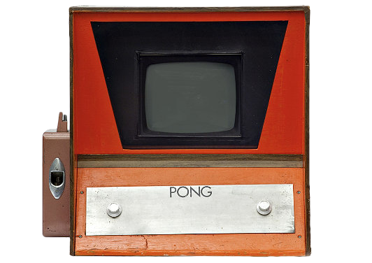
Pong is perhaps one of the greatest examples of usability for a digital product. The original Pong arcade box featured two knobs. A knob on one side of the box for player one and one on the other side for player two. Twisting the knob on the either side moved the corresponding on screen paddle up and down.
The box had no instructions. The player was left to learn the behaviour and play.
The original Pong machine deserves credit for being a usability success
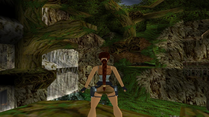
More complex games that require extra behaviours to progress (let’s use Tomb Raider as an example) produce scenarios where environmental situations encourage you to recall certain behaviours, perform the input combination on the controller to trigger the behaviour and progress. In fact most games are essentially sequences of pattern recognition.
One of the most enjoyable facets of gaming is when the player is in a state of flow1 and they perform the actions almost instinctively. The game then feels more rewarding to play because the player is progressing at the ideal pacing and feels more at one with the game when difficulty level and ability level are in perfect synergy.
In Tomb Raider the player quickly learns to apply input combinations in relation to environmental features. Some ledges require a running jump rather than a regular jump to progress to the next area
Repetition plays a key role in establishing these actions in the user’s mind. If you strip the surface texture graphics and reduce the polygon count in Tomb Raider, you would notice that the environments would look quite similar in that they can all be traversed using the same character behaviours but in varied and more challenging ways — the foundations remain the same from the first level through to the end.
There are many lessons we can learn from how games are designed and built and apply the findings to the web. Input combinations that trigger specific actions could appear in the form of gestures or even as part of a visual language. Think about how games teach you to subconsciously perform such actions using techniques like pacing and repetition to help engrain them in the user’s intuition.
You might think that kind of thinking could lead to a deviation from established web design patterns” - it all depends on the implementation. Imagine a first person shooter that didn’t bind the fire action to the right shoulder button on a controller or the left mouse button and instead required you to press a button like ’x’. It would be infuriating because it simply doesn’t feel right. Design patterns occur in games too, they’re just sometimes hard to spot because they almost feel like second nature — which is a very good thing.
Storytelling and narratives
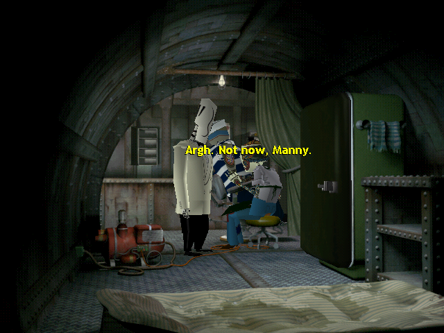
We can learn a lot from point-and-click adventure games. Not even in regards to the nature of the input for the genre — my favourite point-and-click adventure was Grim Fandango which was labelled a point-and-click adventure even though it was controlled entirely by keyboard — I’m talking about how they are structured in terms of their narratives.
All good stories have a beginning, a middle and an end. Point-and-click adventures are (mostly) linear stories made up of sequences that require item collection and puzzle solving to advance to the next sequence. The difference between the web and point-and-click adventures is that the latter wants you to struggle to advance, but not too much. In most cases on the web, that’s not what we want to do, but there are certainly elements from this genre that we can learn from and apply to the web. Adventure games are trying to funnel the user down the linear story without leaving you completely stuck, otherwise the user is less likely to feel compelled to finish the game. It’s the in-between bits that hold this narrative flow together that interests me the most — when the player starts to struggle the game has a job on its hands to keep the player interested and help them back into the narrative so the game can tell its story.
Characters respond to changes in the dynamics of the game. If you are looking for a specific item to proceed to the next sequence and you’re having a hard time doing so, some specific characters will become aware of the situation at hand and perhaps provide help or hints when spoken to.
In Grim Fandango speaking to characters you have already met can often provide clues as to how to proceed to the next sequence
This sense of situational awareness can apply to the web too. As a user progresses through our own narrative, situational awareness can help the user progress to the next scene. Imagine a user adds an item to their cart in an e-commerce website — the dynamics of the situation have changed from when the user began on their journey and we can help them through to the end of the story. Perhaps the user digresses from the shop after deciding to read a rather interesting article on the store’s blog about how the store has been donating a portion of profits to charity. What if the blog post had a helpful block at the end to inform the user of the change in dynamics? Something to the effect of: “And you can help us donate too by buying that t-shirt in your cart. Would you like to do that now?”
Games speak to the players in plain English. No technical jargon like “Your session has expired” — something informative, clear and to the point, but not abrupt and not too long so that it wastes time either. Narrative content is hard.
We really should listen to video game designers and developers a lot more. I would love to see people like Raph Koster speak at web design conferences and talk about flow theory, establishing core gameplay and environmental mechanics and the similar challenges we face in both industries. When it comes to telling compelling stories and teaching users to perform instinctual reactions to scenarios, the games industry has been doing this for a long time and have left a lot of good examples for us to learn from.
Having recently covered the luminosity media feature, I thought I’d take time to document the potential use cases for the other new media features in the CSS Level 4 Media Queries module. Note that at the time of writing these features don’t exist in any browser yet, so the following use cases are theoretical.
Introducing Script
The script media feature does largely the same job as existing feature detection methods albeit on a more limited scale (browsers that support CSS level 4 media queries). It checks to see if ECMAscript (commonly in the form of JavaScript on the web) is supported in the current document. That means if a user has JavaScript enabled or disabled in their browser, we can detect its state and make appropriate formatting adjustments in CSS.
There are certain limitations to what the script media feature can detect. If JavaScript is switched off and a page is loaded, the media feature will correctly report a value of “0” and it will report a value of “1” when JavaScript is enabled. But what happens to the media feature result when the user switches JavaScript off whilst viewing the page depends on the individual browser’s behaviour — it may or may not report a value of “0”. It also can’t be used as a way of providing a fallback if JavaScript errors cause something to break1 because the browser will correctly say that the current document is capable of showing scripts and return a value of “1”. The specification hints at future levels of CSS being able to provide fine-grained results of which scripts are allowed to run on a page2.
Use cases for script
Using the “not” keyword in a script media query would allow us to style fallbacks where JavaScript isn’t enabled. It could also be used for progressive enhancement where the presence of JavaScript isn’t taken for granted.
Here is an example of a script media query written with progressive enhancement in mind (assuming we have a JavaScript-powered carousel):
Similar to the script media feature hover returns a basic on/off (1/0) result depending on whether the primary pointing system on the device can hover3. Although touch-based devices may have the potential for hover capable input devices like a mouse, this media query will still report a value of “0” before any peripherals are attached.
The hover media feature solves a very common problem. Some UI elements that require a hover interacting like mega drop-down navigation menus often appear on touch-based devices that aren’t capable of hover functions. Their appearance is usually triggered by media queries based on screen dimensions which is not a reliable method for knowing if a device is capable of touch and/or hover inputs.
Currently the user agent on a touch device mimics a hover in some cases on the first tap of the hover menu item which seems to apply some sort of :hover and :active state. The point is — it’s not that reliable or user friendly. It takes a bit of guess work for the user to know a single tap activates hover. Thankfully the hover media query can help us fix this issue — as you’ve probably guessed, it detects the device’s ability to hover.
Use cases for hover
Upon detection of a hover-capable input device we could format our markup to enhance interfaces for such devices (e.g. drop-down menus, tooltips etc).
If we wanted drop down menus to only appear on devices that have hover input devices connected, then we would write:
@media (hover) {
    nav ul ul {
        display:none;
                /* Hide the sub menu and position absolutely to the parent li for a CSS-based hover drop down menu */
                ...
    }
        nav ul li:hover ul {
            display:block;
            /* Show the menu on hover of the parent li */
        }
}
Introducing Pointer
Pointer was generally thought of a way to differentiate between touch and other peripheral-based inputs. The media query produces 3 different values: none, coarse and fine — the assumption being that when implemented a non-touch or mouse-based device (like the 4th generation Kindles) would report “none”, an iPhone and iPad would report a value of “coarse” and a desktop machine would report “fine”.
Coarse means that the pointer limited accuracy. According to the spec4, that means that at a zoom level of 1 (your default zoom level) the pointing device would have trouble accurately selecting several small adjacent targets.
Inputs that would give a value of fine would likely be a mouse, a trackpad or even a stylus.
I have a couple of reservations about the pointer media feature and I can see potential misuse or misunderstanding of it.
A potential limitation might be when peripherals are used after the page load. For example would the media query update it’s values if I decided to switch to a stylus during browsing? Also the spec notes that for accessibility reasons some user agents may report a value of “coarse” in an environment where the input would normally be reported as “fine”.
The takeaway from all of this? Don’t rely on a coarse pointer to mean touch. Loading touch UI elements based on the accuracy of the input device is trying to solve a problem with the wrong tools. We should take pointer accuracy at face value — it can only tell us how accurate the input device is, therefore our formatting changes within a pointer media query should only make adjustments to for accuracy rather than input type. If you want to write CSS for touch enabled devices use Modernizr to detect touch capabilities because relying on the pointer media feature is like relying on a width media query to definitively say “this browser is a mobile phone”.
Use cases for pointer
The specification provides a good use case where you could theoretically enlarge tricky targets like radio buttons based on the accuracy of the pointer. Perhaps “coarse” would be a good default to work from - if we assume that the device is inaccurate then we can progressively enhance for accuracy.
The following code demonstrates how we could potentially improve accuracy on UI elements for devices with inaccurate pointers and reduce their size for devices with accurate pointers:
The new media features offer great opportunities to progressively enhance our designs. I don’t think any of them should form the foundation for a design, nor do I think that they were ever intended to be used in such a way. What they do provide is a way for us to finesse the details. Make sure to check PalmReader to see when the new media features arrive on your device.
Media Queries Level 4 builds upon the existing media queries specification that many of us use when we build responsive designs today. The Media Queries Level 4 specification introduces four interesting new media features: script, hover, pointer and luminosity. At the time of writing the specification has yet to be implemented in a browser, but that shouldn’t stop us from exploring the potential use cases.
The luminosity media feature has garnered interest from the web community, it will allow developers to make CSS adjustments based on changes in the ambient lighting in which the device is used. The user’s device must be equipped with a light sensor to trigger this new media feature.
The most obvious use case for the luminosity media feature is to adapt a design depending on whether the user is reading the page during the day where ambient lighting is brighter or during the night where ambient lighting is darker. We already see this behaviour in a few native apps.
Digg Reader on iOS can change its theme depending on the brightness of the environmental lighting
The thing about designing for the web is we don’t have the same prior knowledge of the destination device that designers for native apps do. The light sensor’s sensitivity on an iOS device might be different than an Android device, and the light sensor’s sensitivity on an Android device might be different to the light sensor of another Android device, so we would need to be careful with the degree of change we make as it could be jarring to devices that have an overly keen light sensor.
A normal luminosity level represents the screen being viewed in ideal lighting conditions. I would recommend working from this level as your default — and rather than wrapping those styles in a media query targeted for normal luminosity levels it would probably be best to leave those styles unwrapped so browsers and devices that haven’t got the capability of seeing the luminosity media feature can see the page in it’s ideal condition. You can then use the dim value to make adjustments for darker environments and washed to adjust styles for brighter environments leaving the default styles accessible to all devices whether they are equipped with a light sensor or not.
I mentioned earlier about the potential differences in the light sensor hardware sensitivity — I think this is a key reason not to go over the top with the changes we make within luminosity media queries. Can we definitively say that a cloud passing on front of the sun will not trigger the dim luminosity media feature? The last thing I’d imagine the user wants is a harsh change between light and dark designs that is too easily triggered.
Potential stylesheet changes from dark to light environments (left to right). Subtle changes in contrast are key for avoiding a jarring user experience when environmental changes occur
As with other facets of web design, we should strive to stay out of the user’s way when they are trying to enjoy our design. The luminosity media feature has the potential to be the most annoying media query at our disposal, it could be responsible for ushering in a new era of glow in the dark websites — let’s just be careful with it when it arrives.
I count myself lucky to work in such an exciting industry. When friends or family outside of web design circles ask me about my job I tell them that it is exciting. I often tell them that “No two days are the same”. In a recent moment of clarity I realised that there are very few parameters in our work that stay the same. The web as a medium changes every day, in fact it is changing all the time.
The television industry broadcasts to a specified aspect ratio. This aspect ratio fits the dimensions of TV sets and the broadcast is either squashed or stretched to fit the image depending on the size of the set. The viewer has limited control over what they see and how they see it. Using their remote control, they might have an option to change the aspect ratio from 16:9 to 4:3 which distorts the image and breaks the broadcaster’s intended design.
The newspaper industry generally operates to either broadsheet or tabloid sizes on a paper canvas. The reader has slightly more control than the TV viewer, they can fold the paper and take it with them or perhaps fold it to make it easier to hold and read. However this breaks the publisher’s intended design. The graphics and the text are broken between a line through the layout originating from the reader’s fold.
The web industry is more complex. The web is constantly in a state of flux. There are no absolutes. You could almost say that no two users computers are the same. Think about the parameters that affect how our work is observed: different screen widths and heights is an obvious example, but look deeper at the additional parameters that can affect screen size — in Chrome some users prefer to browse with the bookmarks bar in view, some without. Some people might have additional toolbars that reduce the viewing area further meaning their experience will be slightly different to someone else’s. Other factors that affect how someone sees our design include different colour profiles between browsers, different colour profiles between monitors, manually adjusted colours and contrasts, browser extensions that block advertisements, browser extensions that block design and show only the content, browser extensions that add functionality and manipulate designs like Skype’s phone number extension — just to name a few.
Under the hood of the browser a slight difference in the version number could introduce any number of tweaks that affect a user’s experience of a page — perhaps the javascript engine has been improved meaning user A’s computer presents your design better than user B’s computer. Maybe the font hinting has been tweaked between a revision number, Flash might be disabled or enabled, experimental features might be active or inactive, and diving deeper into version numbers — a browser version number might be the same between two computers but they might have different versions of Java™ or QuickTime plugins. I find it hard to believe that there are a wealth of identical environments viewing our designs, the notion of no two being the same doesn’t seem so far-fetched.
The mind-bending truth is that this is changing all the time at micro and macro levels. A plugin version number can change, a browser can update automatically, the web as a platform can change and is constantly changing. The only absolute is change.
We need to be ready to respond to change. Screen size is just one parameter, but look closer and you’ll find a host of differences that are not present in other media — this is what excites me about the web. We can be true to the nature of the web, adhere to the core values that change slower than the rest like fluidity, typography, engaging content and accept change.
