Design Laws in Nature
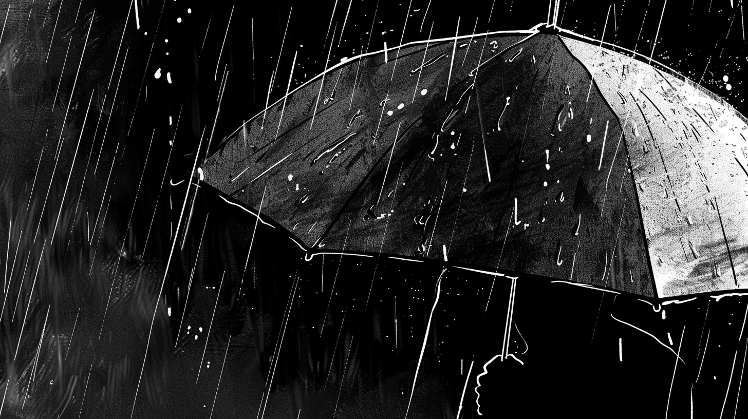
Living in Ireland I have become accustomed to rain as our weather system’s default setting. Umbrellas are dispensable in the Moore family as wind and rain have proved too worthy an opponent for many a shelter device across varying price brackets. When Managing Director of Their Capital, Eric Weinstein, spoke to Tim Ferris about the lack of innovation in umbrella design, hinting that the answer might be in Origami or perhaps nature, my interest piqued and sent me down a rabbit hole.
The rabbit hole confirmed my suspicions that we borrow from nature all the time, particularly in physical product design. The borrowing is often conscious, and sometimes we arrive at the same conclusions for problems that nature has been resolving over vast periods of time. Initially, I took Eric’s challenge on as a thought experiment, and like any good thought experiment, I got lost down an avenue leading to ideas beyond the original scope - even completely separate to the original problem. Distractions like this excite me. I enjoy seeing how deep the rabbit hole goes particularly when the journey is peppered with little epiphanies along the way - a process I call “mining for truths” much to the groans of anyone around me when I verbalise this process.
Evolution: nature’s R&D department
“You could look at nature as being a catalogue of products all of which have benefitted from a 3.8 billion year research and development period”1.
Michael Pawlyn, Using Nature’s Genius in Architecture
Nature’s creations are rooted in purpose. Look around your natural environment and you’ll observe that everything that exists for a specific reason, purpose or function for the benefit of something else within the broader system, and quite likely that entity is good at the thing it is supposed to do. Now look around at human creation on the other hand. You don’t need to look any further than architecture to find that in the vast majority of cases - particularly in inner cities filled with office blocks, the environment crafted by human hands go beyond purpose towards posturing and signalling power and money. Expensive materials serve the purpose of looking expensive compared to nature’s purpose-driven habitats. You might be thinking, “So what?”, “What’s the point in worrying about it?” I’m just observing the fact that nature out-designs us as it has figured out its “why” and is pursuing iterations upon its user-tested design.
Let’s look at a very basic example. Nature might look at a honey bee as its persona (nature needs personas to divide audiences as job stories would provide the same outcome for rabbits and other animals outside of scope. I’m half-joking). The bee’s motivations are to make honey, but it’s a secondary goal beyond its nectar and pollen collecting duties. It has a penchant for bright colours. The plants know this too. Their motivations are to reproduce and they require the honey bee to transfer pollen and spread. So nature designs brightly coloured plants full of delicious nectar with pollen that sticks to the honey bee’s limbs (there is some sort of cookie/tracker metaphor here) and pollination occurs when coming into contact with another plant. Mutual survival goals are met through an evolutionary purpose-driven design process.
Taking into consideration the fact that nature designs with ridiculously long-term goals in mind that benefit the greater whole with system-wide collaborative design decisions, it’s probably worth asking the same of our approach to digital projects.
Biomimicry
The act of borrowing ideas from nature has been recently dubbed “biomimicry”. According to biomimicry.org2:
Biomimicry is an approach to innovation that seeks sustainable solutions to human challenges by emulating nature’s time-tested patterns and strategies.
Examples of biomimicry in mechanics include the Shinkansen Bullet Train, the world’s fastest train at 200 miles per hour. If the Shinkansen Bullet Train was built in the form of traditional trains, it would have created thunderclaps when exiting tunnels due to the sheer speed of the machine. To counteract this unfortunate side-effect, the engineers looked towards the beak of a kingfisher.
“This shape has enabled the new 500-series to reduce air pressure by 30% and electricity use by 15%, even though speeds have increased by 10% over the former series. Another benefit has been confirmed through a favourable reputation among customers that these trains give a comfortable ride. This is due to the fact that changes in pressure when the trains enter tunnels are smaller.” (Kobayashi: 2005)
NASA has several biomimicry projects in development including bio-inspired exercise equipment helping astronauts maintain fitness during spaceflight, solar propulsion mechanisms and glider technology inspired by a seagull’s wingspan that saves on the need for continuous thrust and fuel costs.
Beyond physical features, certain characteristics of digital systems can be found in nature. The internet bears striking similarities with fungal bio-systems in regards to how they pass information and exchange nutrients3. It isn’t clear whether the nature of the web was a result of learning from nature itself, or a case of humans and nature reaching the same conclusion, or a complete coincidence, but noteworthy nonetheless that there are potentially many metaphors we can call upon from 3.8 billion years of evolution.
What can we learn from it in digital product design?
Here’s the kicker: digital design virtually rules out all physical aspects of lessons from nature. The adaptability of our screens in being able to display images, text, art, film, games - that open range of uses is its downfall when looking for like clues in nature. Where does nature project images onto a surface as a means of guiding a subject? We could point towards the fact that birds can visualise elements of the earth’s magnetic fields to aid migration flight paths, or that bats and dolphins make use of sonar to sense the environment around them as wayfinding techniques, but that’s not going to be any useful model for a human in any sort of meaningful way.

In addition to that, I think we’ve been down the skeuomorphic route before in regards to the affordance of digital things where past visual cues inform the use of interface elements within new contexts. Maybe we threw the baby out with the bathwater on that one. Ditching skeuomorphism for a flatter, “purer”, native digital user interfaces seems more like a stylistic decision rather than one that is overly beneficial considering we’ve torn out a massive but hard to quantify familiarity and meaning piece between user and interface. Nature didn’t have a major role to play in such interfaces, even though I would have liked to explore how certain instincts such as fire = burn, snake = fear and prickly surfaces = stingy. Then there is a measuring exercise in seeing how effective these visual cues are over time when the suggested texture doesn’t provide the expected touch feedback as all current touchscreen glass produces the same feeling. If texture’s function in nature is to provide useful function, it certainly doesn’t have any functional application in digital products beyond visual cues.
Apart from animal instincts, natural systems and textures beyond our emulation capabilities, perhaps there are deeper truths within nature that do resonate with humans. What fundamental laws of nature act as guiding rulesets to allow design to emerge and iterate upon itself through evolutionary processes to give some sort of significance in the eyes of humans?
All of a sudden this little rabbit hole is getting a bit deep and asking challenging questions that I am certainly not qualified to definitively answer, but I do have some observations. There are two universal laws (and I’ll use the word “law” loosely here) that improve design and that evolution has deemed worthy of keeping over time.
The Pareto Principle
The Italian economist Vilfredo Pareto stated in his first published paper in 1896 that approximately 80% of the land in Italy was owned by 20% of the population. One of the common axioms of business management is that 80% of the work comes from 20% of your clients as demonstrated by Richard Koch in his book the 80/20 Principle (an alias for the Pareto Principle). Some attribute this observation back to Biblical times, specifically Matthew 25:29 where it reads: “For unto every one that hath shall be given, and he shall have abundance: but from him that hath not shall be taken away even that which he hath.” This seems to align with the with the observation that the richest 20% of the world’s population controls just shy of 83% of the world’s income4.
The basic structure of a Pareto statement is that 80% of the effects originate from 20% of the causes.
It’s a useful lens to look at everyday things in your life, your work and even your design decisions. For example, 20% of project effort in building out a design system might cater for 80% of the interface decisions required. 80% of the value you deliver in a particular project might come from 20% of the product.
I’ve had conflicting thoughts as to whether to include the Pareto Principle as part of this article. It appears to be a law that transcends time, culture and government pointing it towards being categorised as a Natural Law but the majority of its examples (some of which covered below) seem to reveal more about the nature of human influence rather than Nature itself. I lean towards the notion that the Pareto Principle is an observation rather than a law of nature5, and there is a nuanced difference between Nature and what constitutes a natural law, so it would be rather clumsy to conflate the two without pointing out this discrepancy. That isn’t to say that the Pareto Principle as an observation isn’t true, it’s a consistency that seems to house a deeper truth about human nature which will at least have its uses rather than discounting it as part of the discussion.
Fibonacci and the Golden Ratio
Let’s start with the obvious one - this seemingly universal rule appears out of mathematics, the much-dubbed language of the universe.
The Fibonacci sequence was introduced in the Italian mathematician Fibonacci’s book Liber Abaci (Book of Calculation) as a means for solving a problem regarding the growth of rabbit populations based upon ideal conditions (a boy and a girl born at each birth). The sequence of numbers from the solution became known as Fibonacci numbers. As these numbers grow the ratio between two adjacent terms resolves neatly at 1.618, also known as the Golden Mean, the Golden Ratio, Phi or the Divine Proportion.
This measurement exists throughout nature, from small scales such as the arrangement of sunflower seed heads, the fractal-like spirals of seashells, to larger scales such as the breaking waves of the ocean to the dizzyingly large proportions of spiral arms of galaxies. More immediately, these measurements appear throughout the human body between joints, the proportions of the eyes, nose and mouth on the human face - these eerily omnipresent ratios permeate nature and appear to indicate some sort of universal beauty and truth that speaks to human observers.
Artists such as Leonardo Da Vinci and Salvador Dali have utilised this rule in their works. Da Vinci was a close personal friend of Luca Pacioli, author of Divina Proportione, a three-volume treatise on the Golden Ratio in 1509. Was this friendship the source of Da Vinci’s implementation of the rule in his paintings? Whether he did or did not utilise the Golden Ratio to paint the Mona Lisa or consciously employ it in the Last Supper is subject to much debate. The Vitruvian Man however clearly illustrates Da Vinci’s fascination and understanding of the phenomenon which appears to predate both the Mona Lisa and the Last Supper, make of that what you will.
There have been experiments in digital design to utilise the Golden Ratio. This seemingly algorithmic property of nature feels like a good candidate for systematisation on mathematically-based platforms. When Tim Brown introduced his Modular Scale at Belfast’s Build Conference in 2010 I was struck by his emphasis on meaning when defining harmonious typographic scales. Here Tim presented a replicable formula (1:1.618) and adapted it for a medium beyond Greek architecture and growth patterns in plants resulting in a series of numbers that when applied produced harmonious digital typographic hierarchies and layouts.
Tim’s talk had such a profound effect on my work that I threw out my old methods of picking numbers out of the air for things like element widths, font sizes and vertical rhythms and instead explored a more meaningful set of measurements true to nature, born out of maths, the language of the universe.
Back to traditional art for a moment. One of my favourite paintings is Salvador Dali’s 1955 piece The Sacrament of the Last Supper. It is by far the lesser known of the two famous Last Supper paintings, and like Da Vinci’s, Dali unapologetically employs the Golden Ratio in the altar that dominates the centrepiece of this remarkable union of religious imagery and surrealism. Here Dali had a reproducible algorithm for beauty, harnessed from nature, communicated back through his medium, the canvas, stirring the soul through the eyes of the viewer.
Constellation
Brian Moriarty is one of my heroes in the gaming industry. He is best known for adventure games such as Loom and The Dig as well as his infamous lecture “The Secret of Psalm 46” which has been adapted into a dramatic production, a graphic novel and plays a role in my favourite video game, The Witness (no spoilers here, sorry).
In another one of his lectures titled “Who Buried Paul?”, a deep dive into the Paul McCartney death hoax, he outlined human propensity for projecting meaning and significance where there is none. Moriarty points out that seemingly meaningless artefacts in Beatles album art led fans to believe that the band were trying to tell them of the death of their friend and bandmate Paul through a series of clues such as the floral arrangement on the Sgt. Pepper’s Lonely Hearts Club cover that appears to spell “Paul?”. Also, the backwards messages that seem to say “Turn me on dead man”, and “Paul is dead man, miss him, miss him”.
“Humans project meaning and significance where there is none, particularly in cases where none exists. The meanings we expect to see. The significance we WANT to see. Constellation is a form of self-recognition.”
Moriarty calls this phenomenon “constellation”, a human desire to see patterns and make connections between points. Looking up to the stars in the night sky, our ancestors created many images through self-recognition and seeing meaning and significance between points of light across a dark expanse. These connections appear to be stimulated where novelty exists rather than manifesting from the mundane. Look at the Beatles For Sale album cover juxtaposed with the Sgt. Pepper’s Lonely Hearts Club artwork. One generated meaning and a multitude of interpretations in the eye of the beholder where the other just framed four guys from Liverpool ready to sing a few songs for you, the listener.
So how does constellation, or the act of constellating help us design better digital products? Firstly your product needs to serve a purpose beyond a utility, particularly if that purpose leads to meaning or reveals greater truths. Constellating is a quick means to meaning, what red herrings give rise to speculation and new interpretations? Why do some of the great films such as Donny Darko leave parts of the story untold? People fill in the gaps with personal significance which means that somewhat counterintuitively, incompleteness by design encourages constellation which creates greater personal meaning rather than pre-prescribed, one-size-fits-all meaning.
Conclusions
Nature is our outsourced research and development department. Observing problems solved by nature can help inform how we approach problems in digital design. Nature doesn’t like arbitrary features. It finds a way to shed unnecessary elements in advancing long-term goals over vast systems.
Biomimicry is a lens through which to learn from nature as well as build purposeful things. Beyond physical features, nature appears to hold a series of deep truths that evoke some sort of meaning in humans. The Golden Ratio, the Pareto Principle, affordance, constellation, intention - design with these tools and you are using frameworks built upon deep human and universal truths encoded into nature.