Every new AI model upgrade seems to be accompanied by a general sense of amazement and unease. You get the inevitable flooding of social feeds with increasingly compelling “one-shots” that leave an unsettling pang of this incredible technology eating into what you do for a living, which - not to be too dramatic - feels like a significant part of our identity.
We’ve probably all asked ourselves some form of a question like “what do I do when AI can do everything I do?” Especially considering that there are fewer and fewer corners of what we do to retreat to when this technology becomes more and more capable, and doesn’t require 8+ hours of sleep every night, and isn’t as distracted by the snacks drawer… mmm.
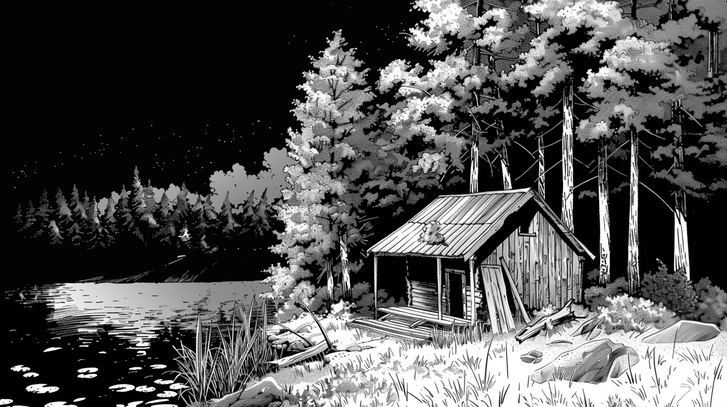
Anyway, it was a regular Wednesday when I loaded up my “1001 Albums You Must Hear Before You Die” daily challenge and it was one I had heard a few things about but never properly listened through - the definitive ambient music album: Brian Eno’s Music For Airports. It was a nice listen. Good background music for my usual rummage around Wikipedia to learn more about the album of the day. I was reading through the facts about how the album was made and I couldn’t help but notice that Eno, in 1978, made a move that I feel maps the direction and purpose of creative work in this current unmapped era of creativity.
I want to reassure you at this point, I’m not making some contrived historical reference to introduce the main idea like every business book ever written, this is actually useful and actually applicable. When making this album, Brian Eno’s studio would have looked like a network of tape loops. Long stretches of tape running between spindles at defined intervals. Each reel contained an idea - one loop might contain a single piano note, another might contain a vocal sustaining a note, and they would all repeat continuously along these different intervals due to how far the reel was stretched across the room. Eno recorded the results.
I just set all of these loops running and let them configure in whichever way they wanted to, and in fact the result is very, very nice. The interesting thing is that it doesn’t sound at all mechanical or mathematical as you would imagine. It sounds like some guy is sitting there playing the piano with quite intense feeling. The spacing and dynamics of “his” playing sound very well organized. That was an example of hardly interfering at all.
— Brian Eno on the making of Music for Airports
This became what was later labelled “generative music”. The systems and conditions that Eno put in place “made” the album. Rather than playing the individual instruments himself at the time of recording, the tape loops simply played and the music organised itself. Quite a remarkable process for its time, but what really grabbed my attention was how people reacted to the music. Eno spoke about this with Rick Rubin on the Broken Record podcast.
…people listen to (the music) and think, “oh, that’s nice. How did you do that?” When you tell them, they’re inevitably disappointed because they thought it was a moment of artistic inspiration. And I say “it was, it just happened somewhere else further back along the line.”
— Brian Eno on the Broken Record Podcast
The idea that the creativity “happened further back along the line” felt like a moment of clarity in amongst the ever-present sense of identity loss.
I started writing my thoughts about this a few weeks ago when I started to observe that the general running of a company is like a series of loops. Since then, loops have become a big talking point in the last week - the idea that people should build little systems that do the work and tweak them between runs rather than doing the manual coding and/or co-piloting.
How very Eno.
A quick warning though - I feel like “Loops” are just this week’s word/approximation of the broader move that goes way beyond small, repeatable processes into any act of creativity that AI appears to be chewing through as we speak.
Brian Eno made the move from instrumentalist → producer. It didn’t make him any less of a musician when he no longer played the notes, the instrument changed and so did his relationship with it. As a designer, my instruments for creative work are Figma, typefaces, imagery, and code. If I move into producer mode, the creativity happens further back along the line where I create the conditions, observe the output, tweak the conditions, and experiment.
I’ve used the word “creativity” a lot because I am speaking from my direct experience as a designer, but for me this extends to anyone who has created a company process, built a system, written code - it’s the same flavour of move from operator → producer. The creative decisions at that level are far more powerful than anything that you can do as an individual at the coalface. At least that’s how it feels to me: losing a walled garden, but gaining a kingdom.
Here’s a thought exercise: if you grew up in the 80s, 90s, or early 00s, put yourself back in the mind of the younger version of yourself and ask “what would the world look like 20/30/40 years from now in 2026?” I’d bet that any impressions you had of 2026 from growing up as a kid in those time periods were vastly different to the extremely ordinary reality around us.
Music is a great example of how creativity has entered a bizarre phase of blandification. If you’re asked to imagine what music from the ’90s sounds like, you’ll likely jump between genres like grunge, Britpop, electronica, jungle, drum and bass etc. The ’80s sound is defined by synths, ’70s - hard rock, folk, disco, and the ’60s has its own concrete, definitive idea of what it was. Mark Fisher captures this perfectly in his writings on the Slow Cancellation of the Future:
Imagine any record released in the past couple of years being beamed back in time to, say, 1995 and played on the radio. It’s hard to think that it will produce any jolt in the listeners. On the contrary, what would be likely to shock our 1995 audience would be the very recognisability of the sounds: would music really have changed so little in the next 17 years? Contrast this with the rapid turnover of styles between the 1960s and the 90s: play a jungle record from 1993 to someone in 1989 and it would have sounded like something so new that it would have challenged them to rethink what music was, or could be.
Mark Fisher was writing about a 17 year window at the time. That window is now over 30 years old and counting. The (present) future feels very stuck. Why does 2026 look a lot like 2016, which looks a lot like 2006? At some point after the turn of the century it's like we forgot what the future looks like.
From an aesthetic point of view, past visions of the future from the simple, everyday whimsical tech of The Jetsons from the 1960s through to the elaborate, maximalist visions of the future from games like WipeOut in the 1990s. The visual journey of the future always carried a sense of awe (just like a jungle record put in front of a 1980s audience) and decade upon decade, it elevated a sense of visual excitement along with it.
But here we are now, in a year that sounded like the far future to us children of those decades, and the world around us doesn’t look overly different. The slowing of technological progress is well documented by a lot of people a heck of a lot smarter than me, so I’ll focus on a much more manageable window where I feel this stagnation (and regression) manifests itself: user interface design.
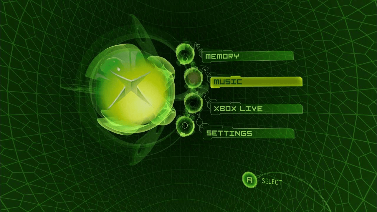
Take a look at the original Xbox menu (2001). It’s wonderfully alien - which is a quality that used to be present throughout visions of the future - the fact that it is alien to everything we are familiar with now, but it then becomes normal and pushes things forward.
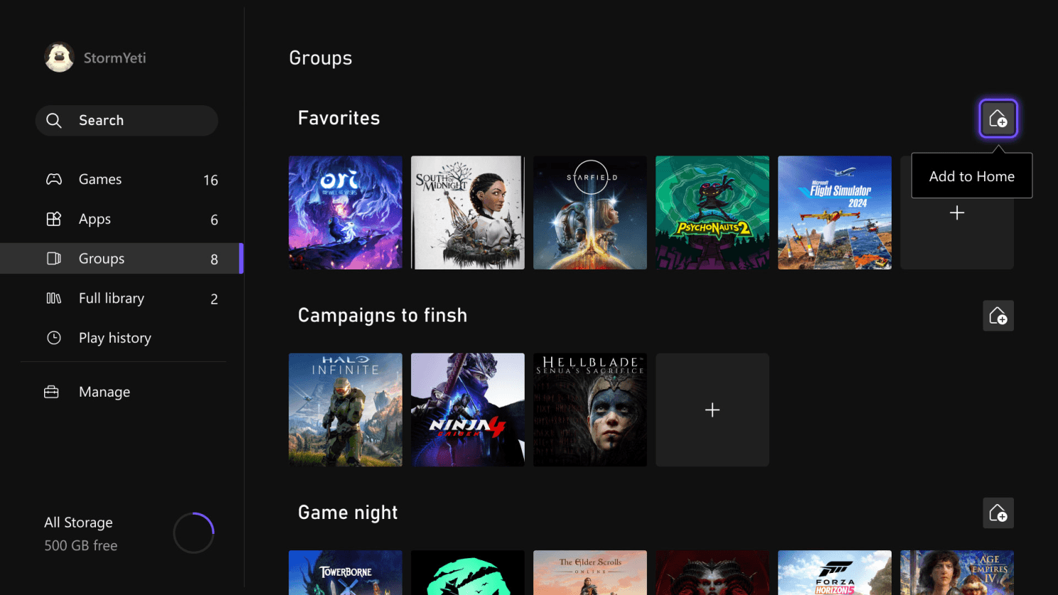
Compare that with the blandified menu as of 2026 and all of a sudden that sense of awe is gone. Sure, it’ll have been A/B tested for efficiency within an inch of its life, and it will pass any number of usability tests, but for all those measurable upsides, it leaves a felt sense of emptiness in contrast to the ambition of the original interface.
This is almost universally true across any digital interface you could come into contact with whether it be on the web, in gaming, a mobile OS, a desktop OS, the display in your car, on your fridge - they all speak the same visual language and that is: in place of alien, you have this safe, soft-edged, muted, predictable, bland interface which, as a side note, is almost hilariously easy for AI to replicate precisely because of all of the aforementioned descriptions.
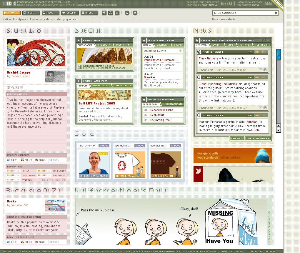
Modern interfaces have a tendency to baby their users. I feel that they underestimate their user’s capability of being able to handle more information, or even their capability of handling anything radical or surprising. Compare that to how k10k presented itself to its users in 2003:
In another bizarre reverse trend, the only reason sites like k10k didn’t increase the information density and design detail further was because screen resolutions were limited at the time. So weirdly, smaller screen resolutions had more ambitious designs than today’s extremely high resolution screens that house basic, bland designs.
I’m aware that everything I’ve said so far can be easily placed into the “old man yells at cloud” bucket, but I genuinely believe it’s more than a nostalgic “I like things the way they used to be” thing. In fact, I worry that too many good, solid arguments get shot down with “that’s just nostalgia” - which is such an empty statement unless you can back it up with actual counterarguments. As I mentioned earlier, this stagnation is undeniably societal, and I believe it’s a spell that can be broken simply by noticing it, otherwise you sleepwalk through it.
I have a hunch that one of the reasons that design has stalled is similar to the learned behaviour as seen on (or heard across the living room from my wife’s phone) every “Get ready with me” TikTok video that adopts the same sing-song voice and sentence patterns that were non-existent before 2020. All of a sudden, everyone accidentally falls under the spell of “the done thing” and follows the same implicit rules, and when you notice it, it’s like an annoying itch from inside your brain that can’t be scratched. That’s where I feel we’re at with the blandification of design - a barren landscape where ideas must follow the implicit convention of no surprises, treat users like idiots, use the accepted presets, and so on.
Another reason that is difficult to avoid is the over-systemisation of interface design where component libraries and design systems are championed over the artistry of interface design - basically scaling at the cost of craft and meaning. Essentially the McDonalds template of serving food fast to the masses versus the independent restaurateur who isn’t interested hellbent on scale and throughput.
I love nothing more than finding things that break this spell. Arc did this in a big way in 2023 and amassed a userbase of obsessives who were fiercely loyal to a web browser of all things. Arc broke a number of conventions both functional and aesthetic, and it was a breath of fresh air in a stale browser marketplace. Linear achieved the same with their craft-heavy approach to their (groundbreaking at the time but now often imitated) landing pages.
The antidote to this technological and societal stagnation (if there is one), I imagine, is to dream about daring futures again and aim for the equivalent of playing jungle music to the ears of listeners yet to experience anything like that. Design isn’t feature-complete. There are plenty of alien ideas to be found that would break the spell of stagnation where design has stopped daring to define an era like the decades before the turn of the century. Software HAS swallowed the world, so user interface designers are well positioned to influence what the future looks like and excite people again. Users can handle it.
As I write this, I’m about half a year deep into rebranding my company. Hugely frustrated because I’m almost sure I’m accidentally on a second lap of the hero’s journey for this whole project.
To distill the whole thing down for a second: my company is undergoing a long overdue rebrand to transition to where the company is today away from the stall we set out to the world back in 2016. As a designer, I mistakenly sleepwalk into branding exercises because it looks ridiculously easy, and I fall for it every time. One really simple question seemed to wedge open the whole topic of branding for me…
How come brands like Nike and Apple feel colossally different to the brand I’m trying to build from scratch?
I asked myself this question out of frustration staring at a bustling Figma file full of logo sets that I spent a lot of time dreaming up, the typeface that I finally settled on after weeks of meaning-making to marry it up with this new direction, colour palettes, slogans etc - and here’s the egotistical thing that I know anyone reading this will scoff at, but let me make my case: the assets I was creating weren’t any worse than Apple or Nike - in places, I felt I was doing typography better than Nike, and, in fact, I was almost sure that if I had no idea who Nike or Apple were, that on the first encounter of my new logo alongside Nike and Apple’s, there’s a good chance that my logo was as good, if not better than both of theirs.
I know what you’re thinking, and hold on to that feeling for a second, because this is the whole point that we’ll get to very shortly.
Where are the playbooks?
I need to get this aside out of the way first. There isn’t a single good branding book that will tell you how to get from nothing to the level of Apple. There is no step-by-step process. This isn’t like learning JavaScript where you can build the knowledge from the ground up and you’ll get a definite sense of whether you’re either right or wrong along the way.
Yes, branding is subjective, but that still doesn’t answer our question of why Apple and Nike feel different to anything you’re trying to build from scratch. To simply label it as “subjective” is a cop-out from trying to pin down the elusive REAL answer which starts out as something like: a brand isn’t about logos, typography, slogans, and colour palettes - it’s part of it, but there is a huge amount of wispy je ne sais quoi that might actually be the main part of branding and no book, no course, no amount of LLM-hand-holding can help you create THE MOST IMPORTANT PART of the whole thing!
Antimatter
In all of the branding books that I devoured during this process, Marty Neumeier came closest in The Brand Gap when he said “a brand is not what you say it is, it’s what they say it is”, which is true, but there is something even deeper going on. Branding, as far as my little interface designer brain can understand, consists largely of inferences that happen on a subconscious level from other people who encounter your brand.
You can give them all of the pieces: logos, ad campaigns, all of those assets I mentioned earlier and more, but the rightness of a brand sits solely in the subconscious of the people you’re trying to reach. So when people think about Nike and Apple - they’re not really thinking “just do it!”, “think different!”, “a geometrically-pleasing apple icon”, in fact, they’d struggle to tell you what they’re thinking about either of those brands because it’s happening subconsciously!
It’s all just one big game of nudging subconscious inferences around.
So while I’m wrestling with pixels in Figma trying to manipulate something into feeling right, the real battlefield is actually some sort of Jungian jungle in the mind of the beholder.
Ego & Brand
Now that I think about it, brand designers would probably benefit more from reading any Eastern philosophy that looks deeply into the lack of a “you” when trying to pinpoint the seat of yourself in conscious awareness. “You” don’t really exist apart from a set of stories that have been woven over time from the moment you received a name on this planet, memories, patterns, felt associations that “clump” together to feel like a solid identity over time.
And what else are brands but exactly that? The best ones have enjoyed long stretches of time to establish that sense of solidity where you have your own personal stories, memories, patterns, and felt associations with a brand which is why Apple simply feels like more than a set of assets that I’m pushing around on screen to try and “click” into something that can finally stand shoulder to shoulder with the branding giants of the world.
It simply doesn’t work like that. It operates very much like your own ego, your own life story, your own sense of you. When you try and pin-point “branding”, it’s a struggle to know where to look, yet when you see it, you know what it is.
Designing for the Subconscious Level
This is where I’m supposed to land cleanly on a solution, when really I’m in “I have a few hunches” territory. From where I’m standing, it looks like the best thing you can hope for is to nudge people towards preferred inferences. Take Apple as an obvious example - at some point in my life, I made the inference that “creatives use Apple devices”. Apple never sold that idea directly to me. Maybe the Mac vs PC ad from that era made me misidentify with the suited square who represented the PC side played a small role? Perhaps it was seeing Macs slowly infiltrate my class in university as they started to outnumber Windows machines. Maybe it was the fact that their operating systems had cool names like Tiger and Snow Leopard, which was completely contrarian to my world of Windows 98, Windows 2000, Windows XP, Windows XP Pro Edition, etc. Maybe it was the fact that fonts rendered nicer than Windows’ unforgiving jagged fonts that hammered themselves into the pixels at whatever cost. Maybe it was all of those things and thousands of other activities - the point is, the obvious, tip-of-the-iceberg surface layer stuff of branding assets, positioning, and slogans had a very weak influence on my feelings of Apple as a brand - it barely registers, and yet that is what most of the reading materials around branding tries to describe as the totality of the art of branding.
It’s far from the complete picture. The greater influence IS the antimatter that you don’t see. It’s the ego brand that forms over time through stories, memories, patterns, associations - all of which you have some sort of influence over in the mind of the beholder, but the best you can hope for is getting time for the story to unfold, give people helpful pieces and nudges to work with, and then let it percolate.
Let the brand become what it becomes in the minds of the people who encounter it. To me, that makes more sense than anything I’ve encountered after burning through many hours reading about the subject. It’s an incredibly hand-wavy topic and I have a whole new level of respect for the people who are really good at this.
This is an attempt to throw words around an experience that I had months ago and I still struggle to articulate what it was and what it meant. But it was incredible.
I hit a realisation (which I’ll get to in a moment) during the Christmas break of 2024. Christmas, to me, is the peak of the year. It’s what every month has been building towards, and it’s a time to just unwind with friends and family, and as I tend to do each year: reflect. Unfortunately, last Christmas I got sick from Christmas Eve through to New Year’s Day and it sucked me immediately out of the Christmas spirit into a really sluggish, yucky feeling that persisted for too long during my break.
It was at its worst during Christmas dinner where I was trying to put my best face on for the kids. This is the dinner that we all eat copious amounts of delicious home cooked turkey, ham, roast potatoes, and a whole bunch of other tasty items including a hearty dessert. I was struggling after the first bite which was so out of character. I could barely hold a conversation, and by the time it came to clearing up at the end of the dinner, even my own thoughts sounded like they were someone else’s.
It was like listening to someone else’s thoughts — all of the non-duality and Eastern philosophy of “you are not your thoughts”, “thoughts just happen” etc was unmistakably observable because I felt like a third party in my own experience. It wasn’t liberating, it was terrifying.
As the days rolled by, I wondered when I’d feel like “me” again. It got to a point where I accepted that “Jordan” was unreachable and I couldn’t get him back. I’m aware that this sounds crazy, but that’s how it unfolded.
About a week later I was curled up on the sofa falling into and out of sleep. The kids were getting along with Christmas around me so I was half thinking about if I was ever going to feel normal and connected back into reality again and half thinking about the guilt of being present but not there for them.
And then, as if I was letting something finally slip off the last remaining bit of grip on the tips of my fingers: I let go of trying to get Jordan back. “It’s been over a week now, what’s the point? This is the new mode, I guess.”
Then the realisation happened over a very short period of time. I fell asleep and upon reawakening I felt completely empty in terms of my own identity. The labels of “Jordan Moore, company director, designer, husband, father, son, brother” were entirely foreign, but things started falling back into place.
The feeling of presence I had in observing the room around me was as alive as it felt as a child looking around the living room I grew up in. I recognised childhood Jordan and it was like meeting an old friend again as if he was here. The boy returned before he accumulated too much learning about the world around him, which made it not as special as just seeing things as they were. That sense was completely back in full working order, and everything ordinary seemed extraordinary to me.
There was a joy in mundane things. The same sort of every-moment joy that childhood Jordan would have got from something like opening up a VHS case and running his finger round the shape of the object and getting to know it by direct experience. Whatever that was came back.
Everything was at ease, and effortless. There was no need to be anything, nothing that needed doing, and (to paraphrase Loch Kelly) there was nothing to attend to. Just peace and reacquaintance with the deepest, truest “me”.
The best I can describe it is that there was a disassociation event where all labels fell away and slowly started to rebuild from scratch. This brought about a purer existence that I deeply felt in childhood and haven’t felt as vividly as I have got older, learned more things, accumulated more labels and descriptions of the world around me as tools to experience versus experience itself.
That was the primary operating mode of childhood where the world felt wondrous by default because of the underdeveloped labelling function of one’s mind, and everything felt more alive because everything was novel. It’s like observing magic before you know how the trick is performed.
There was no wishing it to be good, or fear of it being bad, there was just how it is with no need to steer it towards something better or away from something worse. That is the effortless ease of childhood being, and I have been spending much of my time looking to return to that way ever since, even though the act of pursuing it is to get in the way of it.
I need to be upfront about a couple of things: the first is that Michael Smith’s thread on Letting Go left such a huge impression on me in terms of being able to throw words around something unwordable which, in turn, made it more accessible to people and inspired me to do something similar and adjacent. The second is that, after years and years of on/off practicing meditation and reading Eastern philosophy, I think that I’ve been going in the wrong direction due to a series of misunderstandings that I want to talk about here because it might be helpful for people similarly confused as to the utility of a lot of this stuff.
What do they mean by “Attention”?
It’s common to come across the idea that you shouldn’t intellectualise this topic, and I agree - the more you add, the more you seem to lose in terms of obscuring the simplicity of what it is, so I’m going to try this in terms of removing confusion that I have encountered from misunderstanding1 attention, awareness, meditation, and being present.
Attention is different to Awareness. Maybe it’s just me, but I found myself using these terms interchangeably even though I knew on an intellectual level that Awareness and Consciousness itself were one in the same. But still, I regularly fudged the terms when talking about it to myself because they’re alphabetically and rhythmically close in the English language. That small, practically subconscious confusion likely contributed to me glossing over a lot of instruction around the topic. Attention (as I am starting to understand it) is similar to a ball of focus. It helps me to visualise that ball of focus as similar to the grey cursor on an iPad with the touchpad on a Magic Keyboard (see animation right or below depending on your device). For me, 99.5% of my attention is spent up in my head. That ball of focus lives there because thinking dominates where I put my attention, and as a result, I find myself ruminating on future events or past memories for the majority of the day, every day of the year.
This leads to feelings of not being present, or in my case, ruminating on where that sense of childlike ease went and how do I go about getting it back again? Which, ironically, leads to that attention ball going to thinking to try and fix it in a loop of:
Need to restore childlike ease
How can I do that? How can we fix this problem?
Hey, I don’t feel very present. Where did that effortless sense of childlike ease and wonder go?
Need to restore childlike ease
How can I do that? …
The spoiler is: that sense of childlike ease was effortlessly present in my early years on the planet because, as a child, I didn’t spend 99.5% of my attention in my thoughts ruminating about the past or focusing on imagined futures. It was mostly spent in flow getting lost in whatever I was playing in that moment: building train tracks and lying down closely beside it to watch the trains pass in detail, tracing patterns in carpets then rubbing them out again, playing the hop-over-powerlines game from the rear seat in the car on a long journey - the usual, obscure things that felt more “alive” than day-to-day adulting.
The rest of this post is about how I think whatever that is (I’ve been calling it the Effortless Ease of Childhood Being), is still there and available, and (I think), it might be as easy as moving the ball of attention around to find it again.
Unsticking Attention
My initial misunderstanding of attention came partly from the literature on meditative practices and Eastern philosophy. I don’t think the translations and interpretations do a great job of articulating this idea (if I have this interpretation of attention correct).
Meditation2 is, in essence, the act of unsticking attention. For years, I wondered what was meant by “watching the breath” and why that seemed like a good thing to do, because whenever I followed this instruction, I would go into “manual breathing mode” and then the ball of attention would snap back up to thinking, or bounce between being in my chest where breathing was happening, then back up to thinking in a thought loop of:
Shit. I’m manually breathing, go back to focusing on the breath you fool
wait, we’re thinking aren’t we? But thinking isn’t bad, just acknowledge it, don’t judge…
wait, still thinking, go back to manual breathing. Oh, why isn’t this automatic?
In short: focusing on the breath simply didn’t work for me. It doesn’t help that I’m a ridiculously shallow breather also. What has only recently clicked, and I could be colossally wrong but right in the placebo sense that it seems to work for me, is that this flavour meditation is the practice of moving that ball of attention from being solely anchored on thinking (which can only ever ruminate backwards or project forwards, it can’t do “now”) and move it to anchor that is nowing like the breath, or in my case, picking an anchor like the sensation of your hands.
Why Move Attention Elsewhere? Why Not Stay in Thought?
If thought is happening now, why can’t thought be an object of attention? It seems like this would work if you could chose the mechanics of thinking itself, if there was a sensation like the rising and falling of the chest or the buzzing of blood pumping through the hands but for thinking. But there isn’t. Just the contents of thought which can’t do now. Only past events (even thoughts like “I’m manually breathing” is behind the beat of now) and future events.
Moving attention to the breath or bodily sensations offers direct access to now. They exist purely in the present moment because they are nowing. Now appears to be the default mode that we were supposed to be abiding in before language started on its own evolutionary path, not unlike technology, where it continues to accumulate more and more labels for things which takes us further from the thing itself.
…if we look at a glass of wine closely enough we see the entire universe. There are the things of physics: the twisting liquid which evaporates depending on the wind and weather, the reflections in the glass, and our imagination adds the atoms. The glass is a distillation of the earth’s rocks, and in its composition we see the secrets of the universe’s age, and the evolution of stars. What strange array of chemicals are in the wine? How did they come to be? There are the ferments, the enzymes, the substrates, and the products. There in wine is found the great generalization: all life is fermentation. Nobody can discover the chemistry of wine without discovering, as did Louis Pasteur, the cause of much disease. How vivid is the claret, pressing its existence into the consciousness that watches it! If our small minds, for some convenience, divide this glass of wine, this universe, into parts—physics, biology, geology, astronomy, psychology, and so on—remember that nature does not know it! So let us put it all back together, not forgetting ultimately what it is for. Let it give us one more final pleasure: drink it and forget it all!
— Richard Feynman
Or in other words: thinking is useful for some things but it is not the experience of the thing itself. The Effortless Ease of Childhood Being, the purer version of who we are as humans, capital “K” Knows this, and the way back to it comes down to where we put our attention.
Meditation as a practice for creating the nimbleness required for moving the ball of focused attention makes sense because the more you practice unsticking attention from thought, the more mobile that ball of focus becomes.
I’ve made my main point at this stage. If you’re interested in two related detours, carry on…
Why Do I Feel More Alive When I’m Sick?
I’m going to take brief detour via another line of inquiry that has puzzled me for some time - and, in the spirit of posting on X/Twitter, I’m throwing out a thing to see if there are others who recognise it. There are occasions, as sad as this sounds, where I have been feeling quite unwell and when I’m on the mend, I have a deep sense of feeling more “alive” and “at ease” during that time period.
The most recent occurrence of this was last Christmas. I was hit by an almighty bug that came to a head on Christmas Eve. I started feeling weak and a bit run down overall, and it meant that I lost my appetite for Christmas dinner the next day - the BEST dinner of the year and this stupid bug was ruining what should have been a time where I could have been enjoying dinner, family, and playing with the kids full of the Christmas spirit. But I was feeling so out of it, that at one stage (being the precious little flower that I am), I started to feel so out of it that I felt like a stranger in my own body.
It was like I was remotely operating Jordan Moore, and the labels of “father”, “husband”, “company co-founder”, “designer”, were all losing meaning and felt foreign on this zombie-like spacesuit that I was lugging around the house for minutes at a time before settling on the sofa to sleep and wake periodically.
There was a frightening recognition of losing myself and falling into a new normal that seemed like it was here to stay. But as I started to feel better, the pieces and labels started falling back into place and I had this undeniable recognition of childhood “me” in the process. It was like meeting an old friend. There he was, and I noticed he shows up now and again when I get quite sick.
To close this strange detour, it seems to be the case that when I’m forced to stop (via something like a temporary illness) everything and rest deeply, and to let a degree of boredom back in, attention seemed to focus itself elsewhere in the body rather than thinking. When I’m sick, I’m too worn out to think, and attention doesn’t seem that interested in it either - it has other work to do. And in the process, I tend to feel oddly present.
Flow and Attention
Flow states are absolutely linked to being present. Flow states reliably move attention from thought to the activity itself; in that sense, the activity becomes an object of meditation. This shift induces feelings of loss of ego, a sense of timelessness, and deep immersion in the thing that you are engaging with.
Most people have a tendency to focus on the richly rewarding flow states like mountain climbing, tennis, solving a puzzle, but I’d also argue that “mindlessly” scrolling social media can be seen as another type of flow state - albeit a fast food one that is dependent on the type of consumption. If it’s funny videos on TikTok, I’m more likely to be in a fast food flow state. But if it’s silly political mud-slinging on Reddit, X, BlueSky, etc, I end up back in my head with thoughts like “all these people are wrong, none of this stuff REALLY matters,” and the attention ball returns to its old spot.
Flow always made sense to me experientially when I get lost in a task and lose a sense of identity in that I’m only focused on doing the thing at hand for the pure sake of doing the thing with no other agenda. Now that I have this ball of attention analogy to play with, I’m also able to connect the dots and see how the 99.5% of attention that wanted to roost up in my thinking brain because it was busy creating problems where there weren’t any moves elsewhere to attend to the task.
Reflections
Attention moves towards where it thinks it should be - whether that’s a flow state where you’re fully immersed in a task, moments of crisis where survival requires immediate focus (or, in my case, mild illnesses seems to trigger a shift). But in our otherwise comfortable lives, with no immediate survival concerns, the mind tends to predict and fabricate scenarios, believing it’s protecting us and hijacks the ball of attention for most of your waking hours.
The way back to the Effortless Ease of Childhood Being seems to be easier through practicing meditation with the intention of shifting attention from thought to the breath or, if you struggle with that like I do, ANY bodily sensation that is nowing on its own, to move the ball of attention from thought to feeling (from past and future to now).
Again, I’m trying to be careful about putting any amount of theory/knowledge on this. I just find that following intuition or following capital “K” Knowing can head in directions that are less useful for recognising the thing that is trying to be communicated, and if there’s a way to use theoretical knowledge to nudge intuition back onto a more useful course, then it’s helpful. ↩
Okay, SOME meditation practices, not all. In a similar way to riding a bike, you have different flavours: a gentle cycle to the bakery, a road race, BMX biking etc. ↩
We tend to build a story out of past events to make sense of the present, with varying degrees of accuracy, but I’m almost certain that I can attribute my career path to the skatepark editor from Tony Hawk’s Pro Skater 2 on PC. This is my short ode to a game that I believe changed the course of my life.
It was the Christmas of 1999 when the lesser-known PC port of THPS2 arrived in the Moore household. I was completely obsessed with that game. After blitzing through the career modes of all the skaters, and all bonus characters, my sights were set on finding all of the gaps in the game (for the uninitiated, a gap is linking two or more objects together via a trick, eg jumping between two buildings). Gaps, in hindsight, was an excellent mechanism way to extend the game beyond the core gameplay of achieving the goals and scores for each level, and it certainly gave me many extra hours of enjoyment out of the main game.
Practical Paradigm Shifts
But I still wasn’t done with the game yet. I wasn’t ready to let go. Luckily I found an early online community within a site called Planet Tony Hawk. If memory serves me correctly, Planet Tony Hawk linked to a forum provider called Delphi Forums where there was a dedicated community to Tony Hawk’s Pro Skater 2 for PC. There I met people who had found ways of hacking the game files to adjust things like view distance, add new tricks, and insert new graphics into the game.
This wasn’t straightforward at all. I recall being frustrated with these fan-made tools that came packaged with plenty of warnings that it could corrupt save files and it was enough to put me off for a while and retreat to the in-game park editor and come up with creations that the community had been sharing with each other.
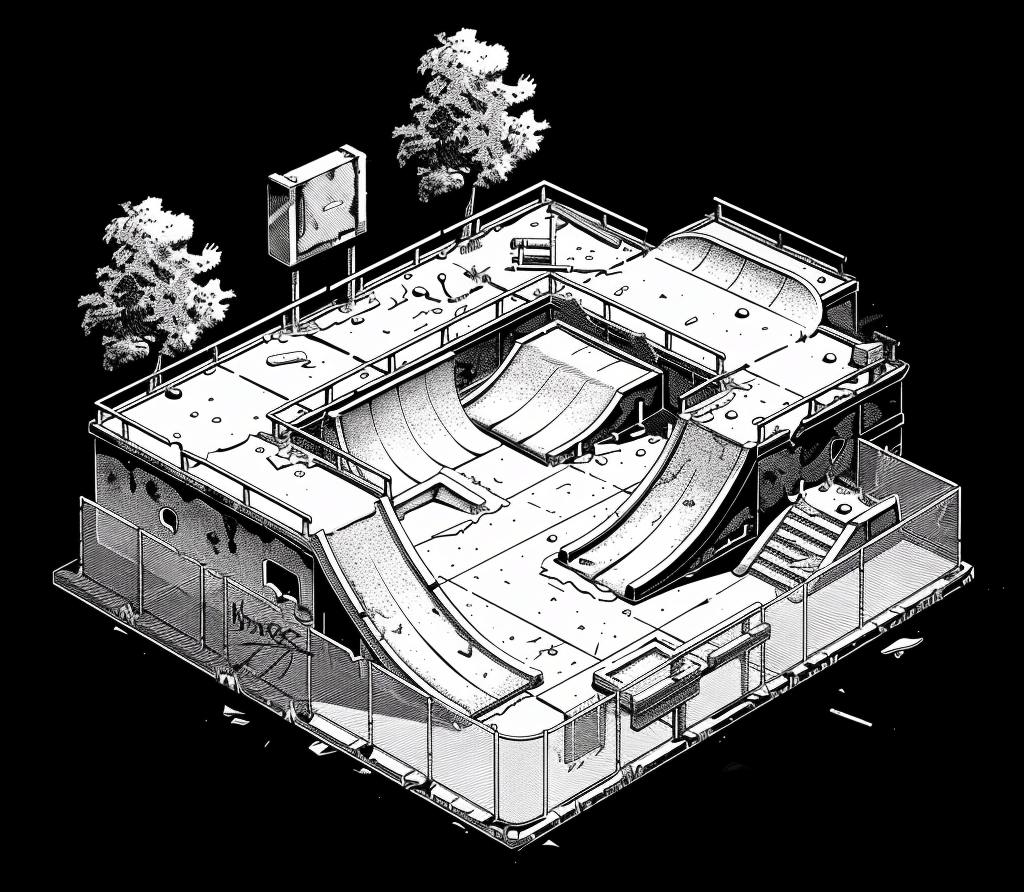
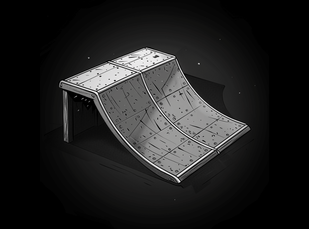
Pro Skater 2’s park editor was a superb example of creative constraints. You had limited space to work with, limited tools (ramps, pipes, benches, rails, and trees), and limited themes. Still, the community around the game found ways of building some really creative levels that had me going back to my grid paper at the time (mostly during class) and rethinking a lot of ideas.
My grand goal at the time was to recreate Camp Woodward from Dave Mirra’s Freestyle BMX. I got as close as I could using the building blocks provided, but the pre-packaged themes meant that a lot of imagination was required if I was to share this park online and seriously have people believe that it bore any sort of resemblance to the real thing.
The overriding image of Camp Woodward from Dave Mirra’s game was the “WOODWARD” sticker emblazoned on all half and quarter pipes. If I could get that graphic alone on the pipe texture, that would be enough to give the map some credibility. I returned to the fan-made tools to try and figure out how to make this a reality. This led me down a path of needing to learn a graphics editor other than MS Paint that could export TIFF images, which was the format required by the tool to insert into the game. I had to learn now to export the wooden pipe texture, add the Woodward logo as a layer and resize to fit, export as TIFF, import to the game and hope for the best.
Any hobbyist pushing their skills beyond their comfort zone and getting the outcome they were looking for knows the sense of satisfaction I got seeing that it actually worked.
Then I wanted to share the map AND the texture pack with the world which meant that I needed to build my first website. Thankfully, the early web had Geocities - the tool that launched a million careers in the industry. I had no idea what I was doing at the time (which is still true in what I do today), and I had no idea that there was even a career path in making web things with digital tools.
Many people talk about how the Pro Skater series created paradigm shifts in terms of openness to different music genres, which it did for me too, but my shift looked like discovering an entirely new hobby, building upon new web design skills through tutorial sites like Pinoy71 to try and replicate a lot of the wonderfully overly-skeuomorphic interfaces of the time period.
Subjective Paradigm Shifts
The secondary, more subtle paradigm shift that these games imposed on their players isn’t spoken about so much, perhaps because it’s not as in-your-face obvious as the prior examples.
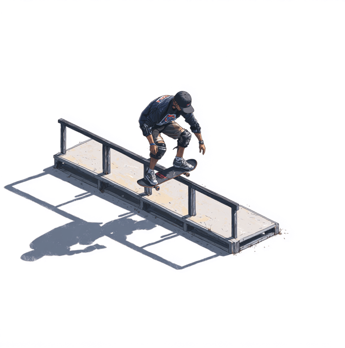
Skaters see the world differently than the rest of us. Where we look at an unremarkable urban area, a skater can see the potentiality of the environment as a skateable space with lines linking objects, surfaces like benches and ledges being repurposed for entirely new uses. When the line works and things become effortless for the skater navigating the terrain, they are undoubtedly in a flow state in an environment that was otherwise entirely dull to any other human walking through the same space.
The level design in the Pro Skater series subtly encourages you to see things this way. The first time you grind a rail in the game, you don’t look at the pixelated rail the same way again. It’s not something to hold on to, it’s something you can use to navigate the environment in different ways.
This exceptional video breakdown of the THPS series produced by Liam Triforce contains a slightly modified quote from the Godfather of flatland skating, Rodney Mullen:
…Mullen once described skating as connecting disparate information and bringing it together in unexpected ways.
— Liam Triforce
Sounds fancy, but it’s exactly how the world looks through the eyes of a skater. And it’s something Neversoft’s developers integrated deeply into the level design. Ramps lead to rails, then to ledges which can be a short manual away to a quarter pipe creating a nice line for a combo to rack up extra points.
It is quite literally a paradigm shift, i.e a change in how you view the world around you. Everything becomes remarkable and new again because you notice the new potential in the environment. The game, skating in real life, and just walking around looking at things becomes borderline meditative. It’s hard to think of any other game in gaming history that achieves a similar effect.
I like to think this helps stimulate the creative mind. Rodney Mullen’s TED talk that contains the previous quote was actually aimed an audience comprising of people from the tech industry. “Connecting disparate information and bringing it together in unexpected ways” is firmly in the realm of working backwards from magic and creating new value.
What I’m trying to say is: I feel like I owe a lot to this game. There are probably even more subtle subconscious shifts induced by the game that I haven’t recognised yet, and I can’t say for certain that the developers intended all of this by design, but I can say with some degree of certainty that if I hadn’t played this game, I wouldn’t have ventured near Paint Shop Pro, then explored Photoshop for some additional power, or had any reason to create a website on Geocities and try to improve it for a small audience.
Bonus: A Few of My Favourite Levels
My original intention for this was to put together something detailing what I like about some of my favourite levels from the game, but I’ve ended up detouring slightly with a short ode to the series which hopefully makes the whole thing a little more interesting than some guy’s boring list. Note that I’m only listing levels from the original 4 games rather than the Underground series and beyond. Anyway, here’s that boring list…
Marseilles: THPS 2 —
A small, contained map which far surpasses all of the pure skatepark competition levels. This level is my happy, Zen-like place. It just feels peaceful. Head to the bowls for intense trick linking, but rolling up towards the road side of the park finds a neat, open urban space at a completely difference pace.
School II: THPS 2 —
There are two iconic levels in this list, in that if you mention the game, this is doubtlessly one of the levels that will spring to mind. School II has several different pockets and moving from the start of the level at the top of the map to the bottom and anywhere around is effortless. It boasts two additional secret areas too which add to an expansive map without it playing as something too bloated.
Alcatraz: THPS 4 —
I could make an argument for this taking the top spot. I find that the levels in Pro Skater 4 tend to be overshadowed by 2 and 3, yet some of the most creative level design takes place in the 4th game. Alcatraz is the standout. It pays enough homage to the real world location with an unforgettable start area with long stretches of grinable curbs to push both manual and grind balance to the limit.
Canada: THPS 3 —
This is the definitive Pro Skater 3 level for me. After the underwhelming Foundry opening level, we’re straight into the diverse design of Canada which features 3 distinct pockets: the car park, the skatepark, and the woodland area which really sold THPS 3 on next gen consoles for me. Where the Foundry level was rigid, blocky, and uninspiring, Canada is big, organic, and is where the 3rd game in the series truly gets started.
New York: THPS 2 —
Like Alcatraz, it’s another overlooked real-world level. New York is 3 levels in one but it doesn’t quite flow as well as other levels — in a timed run, you really need to commit to an area at a time rather than achieving all the goals in one run. The central park area is gorgeous and a contrast to the concrete start area, then grinding the subway rails leads to a rewarding traditional NYC bricked area walled off from the rest of the map.
Venice Beach: THPS 2 —
I know my list is a little heavy on Pro Skater 2 levels, but I simply can’t leave Venice Beach off this list. It leans slightly more towards street skate styles in a map that has vert areas dotted around the perimiter, but as far as levels with a distinct visual identity go, Venice Beach is very memorable.
College: THPS 4 —
One of only two starting levels on my list, College feels very different than anything before it in the previous games. It sprawls to the point of appearing like an open world THPS game and it’s nostagia bright just like your actual college years.
Warehouse: THPS —
Iconic. Along with School II, this is one of the levels that will spring to mind for people when you mention Tony Hawk’s Pro Skater. I personally prefer the Hangar from THPS 2 as an opening level that does a very similar job across a similar(ish) layout, but I can’t not have Warehouse on a top 10.
Airport: THPS 3 —
I’m not massively into downhill levels. Typically they need a reset to bring the player back to the start when they reach the end of the level which, in my opinion, feels like a cop-out in terms of figuring out a level design problem. Airport is reminicent of the Mall from the first Pro Skater game, yet it avoids the reset issue altogether by ending the decent in a departure lounge area with skateable ramps, rails surrounding the area, and a lower level with more ramps. Heading back to the start of this level is nowhere near as arduous as other downhill levels.
Downhill Jam: THPS —
Even though this suffers all of the afforementioned problems with downhill levels, Downhill Jam is FUN. It’s short, it stretches your stats that you’ve accumulated up until this point to the absolute limit with some really challenging gaps and goals, and it still plays well in the modern remakes.
I’m linking specifically to the pipe joints tutorial which was the first place that I can recall doing any sort of UI design resembling skeuomorphic design. This stuff was mind-blowing to me at the time. ↩
My brother bought me a copy of Cal Newport’s book, Digital Minimalism, a few years ago—long before I realised it was an unexpected antidote to a nagging feeling that I’ve had for quite some time now: the feeling that the colours, vibrancy, and general aliveness of life and everything in it seemed brighter when I was younger.
The world tells you to write thoughts like that off as seeing things through “rose-tinted glasses” or that it’s just nostalgia talking and you’re only remembering the highlight reel rather than the mundane, but I believe that this quiet dissatisfaction was more than just a longing for the “good ol’ days.” For instance, how come I can recall the feeling and texture of the door that led into my late granny’s house? I can’t recall my own front door that easily.
As you’ve probably guessed, this is another “phones = bad” piece, but I want to bypass the usual talk of addiction and how these things are rewiring our brains in unhealthy ways and share my experience in adopting digital minimalism and the unexpected upshot of cultivating something that feels like real-time nostalgia.
Technology Constrains Awareness
Again, I don’t want to cover the angles that Cal has expertly documented, like social media’s repeated spiking and exhausting of our dopamine receptors. Instead, I’ve noticed how my own device addiction has constrained my awareness.
When we cup our devices in our hands, they reduce sensory inputs down to a limited, one-dimensional nature. The screen is flat, there is no variance in texture, no associated smell—it’s mostly just visual representations of things in a small box with no additional senses apart from sound on occasion. Our awareness becomes confined and tunnel-like as the world around us just passes us by.
By contrast, the awareness I had as a child was the opposite. It was multi-sensory, big, wide, open, bright. The act of noticing happened because it was a muscle that couldn’t help but be trained every day. There was no living in a physical world as well as the barely noticeable transition to living in a virtual world that we make every day in the present world. Awareness was unbound, alive, connected.
Integrating Digital Minimalism
I was likely living in denial about phone addiction. I knew I had a habit of using it a lot during the day, but as I started going down the digital minimalism rabbit hole and reading up everything I could put my hands on, something about my screen time seemed off compared to the numbers that various authors were reporting. I was easily clocking up a minimum of 5+ hours of usage a day, which I had thought was an average amount… turns out it wasn’t anywhere near average.
My stomach sank thinking about what I would do if I could get all of that time back. It was the perfect kick up the ass to start living out the ideas and practices in the book. Cal Newport’s suggested 30-day social media fast exercise inadvertently became a 5 months and 23 days fast (and counting) through the sheer power of an integrated habit1.
Then I started getting fiercely protective over my attention—and I needed to go there mentally otherwise it wouldn’t work and old behaviours would take over. Integration had to be brutal to be effective. I adopted language with regards to attention being “stolen” which reframed any culprits with disgust and a burning desire cut them out.
Steps included:
Removing all apps except messaging and calls
Blocking all notifications from my Apple Watch except for Activity. (The Apple Watch itself might be next in line to go in favour of an analog watch)
Mass unsubscribing from all newsletters (apart from the ones I really care to read). This took weeks to complete and was oddly satisfying. Do yourself a favour and don’t use a service to do this for you. The action of pressing the unsubscribe button feels like another micro-commitment to the cause
Adding the Screen Time widget to my home screen as a reminder of how much attention has been stolen today
Buying a phone safe. Not a novelty one, a proper heavy one that I can’t open until the timer expires.
Finding alternative habits. This is one of those things that people say in a breezy manner, but again this requires a brutal change in your identity for it to really stick
During the first few weeks, I found myself reaching for my phone even when it wasn’t in my pocket, which really hammered home the fact that I had some unhealthy, unconscious addictive behaviours associated with my phone that I wasn’t fully aware of until I stopped using it. This happened a lot when I found myself waiting for something.
To remedy this particularly tricky habit, instead of trying to use willpower to stop the action, I bought a nice soft cover A6 notebook that fits neatly in my pocket. Now when I reach for my phone, I pull the notebook out instead and write. And I’ll shamefully admit, I have got significant mileage out of doing the judgey thing of looking at others in a waiting situation with their heads craned down and locked on their device—it gives me a little kick of feeling superior which further helps my integration. The books don’t tell you that part, and I shouldn’t have told you that part, but I’ll admit it here because it works for me and my fragile ego and it might help break the spell for you too.
Progress Report
I’m about 6 months into the journey, and as I mentioned at the beginning, it has been something of an antidote to the numbing of experience that comes with constraining awareness.
I have noticed that:
My attention span expanded after learning to lean into boredom again. Remember boredom?
My awareness expanded from the tunnelled version that came with my device usage towards something much broader and much more present
Instead of feeling nostalgic for childhood experiences (or, controversially, Lockdown #1), I noticed I started to get that same feeling about last week, yesterday, and sometimes, that feeling about this very morning
Feelings of time slowing down
Much of the Buddhist literature points out that thinking (or more specifically, the identification with thought) is the source of suffering, and—that sense of dissatisfaction that has crept into my own life the further I get from childhood. I’d add that device usage falls into a very similar category with regard to obscuring our awareness in the immediate now. Thankfully, there seems to be an undo button.
I find a lot of the talk about habits is quite surface-level, not really getting into how powerful and identity-changing actually integrating these habits can be. ↩
I have been using Twitter less frequently than I used to, and now I find myself in a situation where I’m torn between not wanting to engage with the platform at all, and experiencing a sense of loss aversion that Twitter seems to evoke through its various psychological design levers it enjoys pulling (I have a hunch that they do an awful lot more than dopamine spiking through engagement buttons).
I tend to find that during these drier periods, I’ll get random notifications from people engaging with some of my older tweets. Today, someone engaged with a monologue I shared from Hideo Kojima’s Metal Gear Solid 2 released in 2001 which features horrifyingly accurate predictions about social media before social media even existed as well as some correlations with the 2016 election 15 years before it happened, and it covers the nature of memes before the word entered the broader public lexicon.
“The digital society furthers human flaws and selectively rewards development of convenient half-truths.”
“The untested truths spun by different interests continue to churn and accumulate in the sandbox of political correctness and value systems.”
“Everyone withdrawals into their own small gated community, afraid of a larger forum; they stay inside their little ponds leaking what ever “truth” suits them into the growing cesspool of society at large.”
“The different cardinal truths neither clash nor mesh, no one is invalidated but no one is right.”
“The world is being engulfed in “Truth”. And this is the way the world ends. Not with a BANG, but with a whimper.”
After rewatching the video on the lazy Saturday afternoon that it arrived in my notifications, I decided to look into the story behind the monologue and found myself in a dark little corner of the web called “Agora Road’s Macintosh Cafe” which hosted a provocative thread called the Dead Internet Theory, written by someone calling themselves “IlluminatiPirate”, referenced the aforementioned scene from Metal Gear Solid.
Some choice language and expressions aside1, the thread raises some interesting points that are worth revisiting at this point in the history of the web. Many outlets have dismissed the theory in previous years, but now that we’re getting a bit of a feel of where this whole artificial intelligence thing is going.
“The internet feels empty and devoid of people”
Initially, I also dismissed the theory, particularly this part of the author’s thread, but I quickly remembered what brought me here - a notification on an old tweet that followed a pattern I noticed that arises when I spent time away from Twitter. The pattern roughly goes: time passes, an old tweet with an ok-ish amount of engagement for an account of my small size is liked or shared by an account that I have never heard of before with no real person in the avatar and a similar-looking bio to others that follow this pattern.
Hmm.
The Dead Internet Theory thread goes on to make a number of claims, some seemingly outlandish and difficult to verify, some unmistakably true such as the claim that bots are generating more conversations and generating more content on social networks than humans than we realise. Elon Musk’s public sounding of the alarm bell/attempt to back out of the Twitter deal/attempt to drive down the value of the Twitter deal, or some combination of all 3 came to mind when reading through the theory.
As it turns out, bots account for 5% of Twitter users2, which doesn’t sound too scary until you read that they account for 21%-29% of the content on the platform. Close to a third of the content isn’t made by humans.
“Ah but that’s just a problem with Twitter” you might say, to which I was shocked to hear that the problem is worse outside of Twitter’s walled garden - 64% of all internet traffic is bots3. Or to put it another way, humans are the minority on the web.
⌘+C, ⌘+V Opinions
We like to be liked. The Dead Internet Theory thread author made the following observation on human behaviour and how we interface with the web, and how it is prone to hijacking:
The internet is a fast way to get info, and info is what moves the mind, and the thing is, the mind likes recognition. When the “likes” were introduced without negative feedback they created a copy-feedback subconscious, they made it so only “positive” opinions be propagated (also accepted), and in it’s way negative opinions to be obsolete.
Now everyone is too cowardly to have an opinion so they copy others they like, they are more likely to follow trends and say what others said, you can also see it with the paranoia of always wanting to listen to experts.
The fast feedback system of the net created a human obsession to be in with trends, getting away from it makes it so you always feel like you are missing out, to play it safe in a trend is more easy as you can copy what already is accepted. In this way, the internet and social media, which was supposed to democratise media by allowing users to create whatever content they wanted, has instead been hijacked by a powerful few.
Creation of original content is how the internet used to work. Anonymous people were willing to express their opinions and try radical or experimental things. More truly original content, uninfluenced by bots or paid influencers, was created due to anonymity as protection against negative feedback. On the old internet, you could start anew every time you posted something.
Now add bots to this. Make it so an opinion be repeated more and more, they are faster than us, so the positive feedback makes is so we copy the bots, and anonymity can’t do anything against it because we can’t influence the bot like we would a human, this is an easy weapon to manipulate people, so anyone with an agenda can use a bot, is designed in a way compared to how clickbaits are made, most won’t read the content, this creates tv-like propaganda where they aren’t influenced by the user and that puts bots at a great advantage over any other opinion because it wont change, and we are copying that.
To summarise: consensus can be manufactured and propagated into the collective networked mind of social media, which will then proceed to reward those who echo the sentiment back into the network, reciting their predefined opinions.
I genuinely set out without the intention of talking about ChatGPT because everybody has it well covered. And we’ve done so well to get to this point in a piece like this without a clichéd nod to it, but we have to at this point, because no doubt you’ve drawn those conclusions already - the “oh dear God, what happens when we let that become part of this?” type of conclusion. It turns out, there is already a subreddit populated purely by ChatGPT both in terms of posts and replies to itself. The two things that worried me the most about that were learning that:
If the usernames didn’t contain the letters “GPT” you could swear that it was normal human beings having a conversation on the web
And these conversations are running on the old version of GPT: GPT2 (the vastly inferior model)
A few months ago, an interaction on Twitter left me very pissed. I have negative interactions from time to time and they genuinely don’t bother me, but this one did. I posted a UI concept for reading multiple branches of a conversation on Twitter - purely as something I would like to see, and by no means a suggestion for Twitter to take seriously as a solution.
It gained a decent amount of attention (once again, for an account of my humble size) and that was 99% positive for the first few days. Then about a week later, I woke up from a sleep and carried out my usual bad habit of checking email, Reddit, and Twitter first thing after waking and noticed that I had 20+ notifications. Again - for an account of my size, 20+ means either: something amazing has happened - likely some big account has shared something, or something bad has happened.
It was the latter. Sentiment had completely changed on the tweet. Every single new notification took the shape of either personal insult, or sniping at the UI concept - no constructive critique, just some variation of “L take” and other short quote tweets and responses.
I tried to find the source - the one who had flipped the sentiment from 99% good to 100% bad, and I couldn’t find them. I looked at the profiles of the people who were behind the more vitriolic responses, and they all followed a similar pattern:
No real face in the avatar (or AI generated face for that matter)
Poor ratio of following to followers
Followers always capped around the 100 mark
VAST majority of interactions on their timeline were the same sort of replies to other people
I am now entirely convinced that the interaction I had, that left me rattled in a way that I haven’t felt in quite some time on social media, was either entirely bots, or mostly orchestrated by bots in terms of setting the sentiment for others to follow. This reframing has been both helpful and unsettling.
I’ll try and bring this home to some sort of optimistic outlook. It seems that there is at least some degree of validity to the Dead Internet Theory in that bots are starting to run the show, and set narratives to follow. The fact that you rarely see the words “this changed my mind, thank you” in online discussions is something of a red flag to indicate that perhaps the web isn’t the best place to be having these types of discussions anyway. And, in a way, it’s slightly meditative to detach from the emotion of a fuelled discussion online knowing that there is a significant chance you’re talking to machine code.
The alternative path is to pivot towards true, human connection. I’m having more phone calls with people I know from Twitter than I ever have before, and it’s refreshing to have those conversations that aren’t being watched and scored by others.
The friction of the dial-up web where technology kept us from being extremely online was a flavour of how these things should have worked, so maybe it’s time to exercise some self-control and disconnect. Bots don’t have to be a problem in your everyday life if you don’t spend all of your every life with them.
Slightly meta sub point: I believe we need to get better at separating message from messenger. Pre-filtering happens all the time across online discussions where the source determines people’s views on any particular topic to the point that the viewpoint itself rarely gets past the pre-filtering for an honest assessment against the reader’s own values. ↩
According to research conducted by Similarweb - https://www.similarweb.com/blog/insights/twitter-bot-research-news ↩
According to research by Barracuda - https://assets.barracuda.com/assets/docs/dms/Bot_Attacks_report_vol1_EN.pdf ↩
Zen and the Art of Motorcycle Maintenance by Robert M. Pirsig is one of those books, like Self-Renewal by John Gardner, where I come away from it receiving a completely different message from the author than most of the people I talk to about the piece.
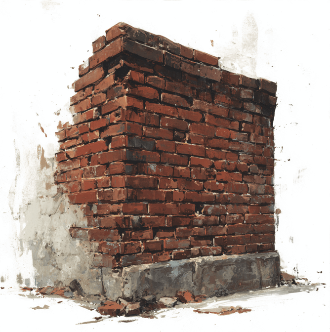
The centrepiece of the book, for me, happens around a relatively obscure passage around the halfway point of the book where Pirsig’s character, Phaedrus, grows increasingly agitated with one of his students who was struggling to complete a 500 word assignment about the United States.
She was suffering from a classic case of a creative blockage in the form of writer’s block. She didn’t know where to start and the size of the task at hand had become so daunting and that familiar feeling of imposter syndrome when faced with the empty canvas staring back at her. The subject was too broad to latch onto a good starting point.
When it came to the due date, the student still hadn’t produced a word. Her creative blockage also impeded Phaedrus when he tried to help her. He suggested narrowing the subject down from the wide topic of the United States down to the main street in Bozeman.
Still nothing.
Phaedrus became angry and shouted “You’re not looking!” at the student. The character remembered a time where he too had too much to say on a subject, and the fact that there are an infinite number of things to say in all directions. The more you look, the more you see.
“Narrow it down to the front of one building on the main street of Bozeman. The Opera House. Start with the upper left-hand brick.”
The student returned to the next class looking shellshocked as she handed in a five thousand word essay.
Pirsig’s Brick
Pirsig’s Brick demonstrates the idea that depth of knowledge can lead to greater understanding at the breadth, or put another way: looking closely at the micro level can unblock you for understanding the macro level.
Another way of looking at the issue faced by the student (and any time we face similar creative blockages in our work) is that there is some unseen force getting in the way of flow. In Pirsig’s example, the impediment to flow was the sheer breadth of the topic to begin with. The book also added that:
She was blocked because she was trying to repeat, in her writing, things she had already heard, just as on the first day he had tried to repeat things he had already decided to say. She couldn’t think of anything to write about Bozeman because she couldn’t recall anything she had heard worth repeating. She was strangely unaware that she could look and see freshly for herself, as she wrote, without primary regard for what had been said before. The narrowing down to one brick destroyed the blockage because it was so obvious she had to do some original and direct seeing.
— Robert M. Pirsig, Zen and the Art of Motorcycle Maintenance
Pirsig’s Brick is a tool for seeing things freshly “without primary regard for what has been said before” which creates that perfect tension of challenge and ability enabling flow. Former chess player and martial arts champion, Josh Waitzkin, is one of the few people I have noticed who has made reference to Pirsig’s Brick in his book “The Art of Learning”.
After referencing Pirsig’s Brick, he notes on understanding:
The learning principle is to plunge into the detailed mystery of the micro in order to understand what makes the macro tick.
— Josh Waitzkin, “The Art of Learning”
And followed up immediately after by taking aim at the blockages of creative flow…
Our obstacle is that we live in an attention-deficit culture. We are bombarded with more and more information on television, radio, cell phones, video games, the Internet. The constant supply of stimulus has the potential to turn us into addicts, always hungering for something new and prefabricated to keep us entertained. When nothing exciting is going on, we might get bored, distracted, separated from the moment. So we look for new entertainment, surf channels, flip through magazines. If caught in these rhythms, we are like tiny current-bound surface fish, floating along a two-dimensional world without any sense for the gorgeous abyss below. When these societally induced tendencies translate into the learning process, they have devastating effect.
— Josh Waitzkin, “The Art of Learning”
I have come to learn over time that most of the art of staying in creative flow is just getting obstacles out of the way to let the process unfold on its own. Robert M. Pirsig has provided us with an incredibly effective tool for not only removing these obstacles, but one that also has the added benefit of opening up new ways of thinking and looking at things deeply in the abyss with the intention of bringing new value and insights up to the surface.
I have wanted to write about working backwards from magic for quite a while now, partially from a place of laying claim to the idea as some smart minds are taking note of the idea, but I didn’t want to rush out a half-baked take on a concept that I truly believe has the power to change the world.
My ego temporarily entertained the idea of writing a book about the concept, however, even though I believe that working backwards from magic is an extremely powerful approach to creative problem-solving, it would be disingenuous to package a relatively simple idea with 200+ pages of padding to make a quick buck in the self-help/productivity niche. The concept really doesn’t need that much unpacking, it’s almost laughably simple and it has the capacity (at least in my experience) to make conventional approaches to problem-solving look ridiculously convoluted by comparison.
I feel that as an industry (and I’d perhaps extend this towards society as a whole) that we are sleepwalking into a level of comfort where big, bold, radical thinking has made way for safe, tried and tested systems and processes that produce reliably similar results and more of what the world already has. The industry seems as though it is short on new ideas and bravery, and big on conventional thinking and mass-producing more of the same. It’s tilting towards anti-progress. Working backwards from magic is the pushback against this mode of thinking.
What is Working Backwards from Magic?
Put simply: working backwards from magic is an approach to creative problems by using the suspension of belief and any limiting factors to unlock new value.
It is a tool that can be turned towards design and development problems, product ideas and/or improvements, essentially anything that would benefit from thinking from new directions and perspectives. It’s an incredibly simple process to describe and, in my opinion, easier to apply than the prescribed templates of conventional creative processes and approaches.
Step 1: Identify the Problem
In order to know where we’re going, we need to understand the problem we’re trying to solve. How deeply you understand it doesn’t necessarily matter, this is more about having something to aim at rather than nothing.
Step 2: Remove all limitations
Leave conventional thinking at the door. It’s of no use to us in this process. Removes all limitations from the problem, all assumptions, all technical restrictions, all preconceived notions and concepts, get all of that out of the way and start from this point because by default, you’re making something new and therefore more valuable. What you won’t want to do is see how others are solving the problem - this gets you back into conventional thinking and solving problems with existing solutions.
Let’s look at the problem Uber were faced with. It didn’t require any deeper definition other than “how do we get people from A to B?”
If Uber looked at what everyone else was doing (reasoning by analogy/conventional thinking using preexisting ideas) they would just have a shinier interface on top of a regular taxi firm website offering a contact form and/or a phone number to call a taxi.
Instead, Uber decided to work backwards from magic and started from impossible. How could you get someone from A to B if this worked like magic? “Teleportation!” Obviously that’s not doable, yet at least, so if not teleportation then what? You would have a personal driver to take you from A to B. You wouldn’t need to be somewhere in particular, this service would know where you are, and you would know how long it would be until your driver gets here - etc etc, and so Uber is born.
By moving all of the limitations out of the way (current understanding of how taxis work, technical limitations, society’s expectations of what a taxi does), Uber was able to create something new and of significantly greater value than the existing solutions to the problem.
The world is full of secrets like this left to discover. We’re lucky we are in software because most of the hardware secrets have been discovered. The web is just getting started and there are millions of life-changing ideas in waiting.
Step 3: Introduce Reality and Meet Magic in the Middle
As we’ve just discussed in the Uber example, it’s not enough to start from magic and leave it at that. There is a need to get real which involves remaining disciplined about keeping conventional thinking at arm’s length.
Working backwards from magic requires you to start from impossible and slowly introduce just enough reality until your solution is as close to magic as possible.
Before Apple took over the world, the old saying was “nobody gets fired for choosing IBM”. Risk-averse people and conformists get left for dust in the long run.
Conventional Thinking vs Working Backwards From Magic
My intention isn’t to encourage a complete rejection of conventional thinking altogether. Tried and tested solutions have their time and place, but at a time where design is self-commoditising in software I can’t help but feel that the industry is declaring “mission complete” and systemising too soon.
Conventional thinking in digital design adopts the generic process of discovery through to completion by passing through all the usual stops along the way: user stories, competitive analysis, personas, wireframes and so on. Such processes are rapidly becoming checklists, or worse - ass-covering exercises so that the designer can blame the process if their work doesn’t quite return on the investment.
Conventional Thinking
Working Backwards from Magic
Starting Point
Find existing examples
Start from impossible
Process
Pre-planned, detailed
Whatever it requires
Solutions
Already exist, may be combinations of existing solutions
Typically new, unlikely to exist
Worldview
No secrets left to find
The world is full of secrets left to be discovered
The issue with conventional thinking is that it often involves an abundance of rules and processes that rarely produce the insanely valuable outcomes. The possibility space is artificially limited from the start. Ideas that create companies like Uber are left for other daring adventurers and the conventional thinker can only watch from the sidelines and wait for ideas to become mainstream before integrating them.
Working backwards from magic starts from a completely different and grander possibility space. It begins with the simple question: “if this worked like magic, what would that look like?”
“It’ll never work”
For this approach to work, it needs to live in a culture that is open to risk, making mistakes, and learning from failure quickly. We are taught from an early age that mistakes are bad and that learning to repeat answers from books is how to progress in life - in essence: do what everybody else is doing, DON’T think different. I can’t help but think that this leads to the type of ass-covering through a plethora of rules, conventions and processes that have become the norm in creative work.
I have found that, in my experience, working backwards from magic democratises design more than existing approaches which seem to revel in the authority of a UX leader type bringing the timid, naive client and others through the dangerous world of design. In contrast, asking a client “if this worked like magic, what would that look like?” brings them to the table without the need to jump through hoops, or worry about saying the right technical terms or have concerns about whether something can or can’t be achieved.
I have also started to become comfortable with the idea that “it’ll never work” is a good indication that I’m on the right track towards creating new value. “It’ll never work” simply means that it doesn’t exist (yet) and you’re firmly in working backwards from magic territory. Your possibility space is infinitely bigger.
What follows is a contribution to this discussion. I’m still unpacking it but it feels timely to push some thoughts out into the open whether they’re ready or not.
I believe that we are collectively tapping into something important within the design system discourse. Something felt, but difficult to uncover and put into words. However, it is gaining shape with some common themes around the role of humans and machines, order and chaos, industry and liberty.
Intentional design systems are the typical approach to building design systems: design system first → design/build solutions from the system, i.e intentionally designing a system regardless of the solution.
Emergent design systems start from solutions and work backwards to find emerging, reusable patterns for the system.
The Reach & Scope of Design Systems
As far as I am aware, there is no collective understanding of the desirable reach of a design system. The intentional camp believes that everything must come from the system. By default, the system permeates the entire product.
In an intentional design system, there is no room for chaos. Only order. If something doesn’t fit the system it doesn’t belong in the system. If something cannot be born out of the system, it will not belong in the system. Intentional systems are authoritarian by nature.
Their liberal counterpart, the emergent design system, begins with creativity and chaos deriving patterns for the system later. Decisions start from user outcomes (the sum of all parts) and work backwards to find reusable parts. It’s hard to quantify the reach of emergent systems. It may cover a small amount of the product, and it may cover a lot of the product. It’s not all-encompassing. There is likely a correlation between the number of unique user problems encountered and the overall coverage of the system.
The scope of an intentional design system is large by default and requires some degree of conjectural bloat (code for scenarios that have yet to occur). When components are front-loaded into the process you get wastage as a byproduct. Guesswork and assumptions are part of the product’s DNA. I don’t blame anyone in thinking that this approach is the sensible direction. We’ve been conditioned to believe the next new thing should come first in the chain of events, whether it’s mobile-first, content first, users first - when it comes to building products in design and code, you can be forgiven for adopting a design system first approach.
Although not a like-for-like comparison, it’s interesting to see that the same voices who would bemoan libraries such as jQuery and Bootstrap - two libraries full to the brim of conjectural bloat - haven’t noticed the hypocrisy in advocating for design system first approaches before building up to more complex components. The same voices who evangelise for accessibility damning jQuery for adverse effects on performance and page weight are happy to tax users for a speculative design system1.
In contrast, emergent design systems require only accepting evidence-based patterns and components into its system. It flips everything on its head asking the parts to prove themselves to be replicable and have sufficient utility. They need the gardeners Frank Chimero alluded to.
A useful lens for drawing that difficult line around the scope and reach of a design system might be around the value of tasks the UI components will provide to users. Low-value tasks (the type that provides limited utility such as a terms and conditions page) are perfect for design systems to do the heavy lifting - if not all of the lifting. High-value tasks (such as a search box on an e-commerce product) should require more human attention and deservedly so. Think of a pilot flying a plane full of passengers - the most critical (and therefore high-value) parts of a flight are: taxiing, takeoff, and landing. Autopilot can take care of the rest. You want your pilot at his or her sharpest for those key moments. Your design system is no different.
The Sunk Cost Fallacy of Design Systems
An intentional design system assumes that your design work is done. You can maintain it, of course, but making changes to the system becomes a bureaucratic process.
We’ve industrialized design and are relegated to squeezing efficiencies out of it through our design systems. All CSS changes must now have a business value and user story ticket attached to it.
I remember coming up against design bureaucracy during my time working as part of a large scale product team. We were faced with many new user problems in need of solutions. The team were hellbent on shaping the solution to the problem out of the prebuilt pieces of the design system. Reasoning by analogy. The method of thinking rarely leads to new solutions for new problems. First-principles reasoning was deemed too expensive.
I was met with arguments like “That means we’re going to have to create a new rule for this component, we’ll have to get internal sign-off, the developers will have to invest extra effort, it’ll need to go through testing, do you seriously want to go through all those steps?”
It was clear that we had been designed into a corner by our design system or at least our organisation’s ideology. What if our initial assumptions were wrong? What if we didn’t have the pieces to address these new problems?
I noticed a pattern. If a problem could be easily solved, low-effort, low value, or if it had already been solved - defer to the system. Watch out for when the system pushes back. If the design system pushes back, it’s time for human intervention and invention.
Individuals commit the sunk cost fallacy when they continue a behaviour or endeavour as a result of previously invested resources (time, money or effort) (Arkes & Blumer, 1985). The same is true for design systems that grow in scope beyond a team’s ability to become dynamic to the system and its user’s needs. Decisions are deferred to the system by default, and anything that requires the system to change is met with often insurmountable objections because of the time, money, and/or effort to change the system.
Useful questions to ask when the system pushes back:
Do we need to amend the system?
Is it a unique case that should sit outside the system?
Is it likely to reoccur in different variations?
Is it something that should be governed by a design system?
Does the system bake in more assumptions than a different approach? (Occam’s Razor is a good guide for software decisions)
Does building the best thing involve building it out of the things we’ve already built? Or does it require building something new?
You can tell what type of design system you’re working with if it biases solutions towards pre-existing components or if the system gives you the freedom to invent.
Leaving Room for Creativity
The majority of systems I hear people advocate for appear to subscribe to intentional design systems. Because of this, one of my overriding fears is that design systems are designing designers out of the picture. For years we’ve pushed against the idea of design as a commodity, yet here we are commoditising design down to atomic levels.
“Sometimes you load up a show on Netflix or a song on Spotify and you can feel the algorithm in it.”
I used to poke fun at the websites of the early 2010s claiming to be “handcrafted”. Now I’m thinking they were on to something. Perhaps “handcrafted” was the wrong adjective, but I think they were trying to describe something else. Something made through more effort, deliberateness, craft, and creativity. These experiences placed more of an emphasis on the importance of aesthetics, they spoke to human ideals such as affordance, familiarity, and metaphor. Flat design lends itself towards low-effort commoditisation and malleability in a design system - perhaps leading to the ideology of “everything that can be systemised, will be systemised”.
There is a certain coldness in the algorithms. You can feel the algorithm in a rigid design system that spans every corner of a product. You don’t want a design system that feels “automated” - well, you might but your users certainly don’t. Your users would rather a product designed with care (dare I say, “handcrafted?”).
The benchmark must surely be what resonates with users - and if that is an amalgamation of predefined components and rules that must work because the system says so, then fine, so be it. I firmly believe that it makes much more sense to start from resonance and work backwards treating users first and systems second.
If I could give an artificial intelligence the keys to fully automating modern design, I’d point it towards an intentional design system. An emergent approach leaves room for mystery, chaos, intuition, creativity and expression - the unpredictable, unique, innately human elements.
Do design systems limit creativity? The answer rests on what type of system you subscribe to.
The worst incarnation of a design system designs designers out of the picture. If I were building an AI tool to displace designers, I’d point them towards an all-encompassing, intentional design system. I fear that we’re blindly running towards automation and we’re giving the algorithms the template our jobs. It’s not hard to imagine a world where No Code technology complements No Design. By contrast, the best incarnation of a design system leaves room for creativity, invention, the human elements.
And my argument is exactly that - we should safeguard the human elements of the design process. There will always be a need for human intervention, the kind of which requires a human eye to correct for optical alignment when the machines produce rounding errors, or perhaps it is our all too human flaws that produce the rounding errors, either way, the goal should be to prioritise people over rules, algorithms, and automation. Ultimately you want to design systems that liberate creative teams rather than systems that constrain creative teams.
Jeremy Keith recently added colour to the idea of intentional and emergent design systems drawing ideological comparisons with language prescriptivists and language descriptivists.
Language prescriptivists attempt to define rules about what’s right or right or wrong in a language. Rules like “never end a sentence with a preposition.” Prescriptivists are generally fighting a losing battle and spend most of their time bemoaning the decline of their language because people aren’t following the rules.
Language descriptivists work the exact opposite way. They see their job as documenting existing language usage instead of defining it. Lexicographers—like Merriam-Webster or the Oxford English Dictionary—receive complaints from angry prescriptivists when dictionaries document usage like “literally” meaning “figuratively”.
When I first read the article, I quietly took issue with where Jeremy’s interpretation landed. The reasoning up until the ending resonated, but I believed his conclusion put intentional design systems on the side of beauty at odds with the emergent design systems - accurate but not beautiful.
I think we can learn from the worlds of web standards and dictionaries here. A prescriptive approach might give you a beautiful design system, but if it doesn’t reflect the actual product, it’s fiction. A descriptive approach might give a design system with imperfections and annoying flaws, but at least it will be accurate.
I think it’s more important for a design system to be accurate than beautiful.
How can front-loaded design systems result in more beautiful products than design systems that begin with the end in mind and work backwards?
Then I realised the flaw in my thinking. Jeremy was describing the design system itself, not the fruits of the system. (The irony of my flawed thinking further highlights my own biases towards the emergent end of the spectrum!)
I feel that one further elaboration is required: an intentional design system can create beautiful design systems, an emergent design system can be created from beautiful products.
I’ve been told that a speculative design system makes the point that I’m trying to make with “intentional” design systems much clearer. I really don’t care what label anyone wants to use as I mentioned in the previous article, I’m not trying to make this a “thing”. I seek no such fame. All I want to do is outline there are two competing approaches here which people aren’t talking about. ↩
There are two competing approaches in designing design systems. I’m going to call these approaches intentional design systems and emergent design systems to create a clear distinction between both.
An intentional design system
This seems to be the default methodology in design circles. The flavour and framework may vary, but the approach generally consists of: design system first → design/build solutions.
I have a few concerns with this way of working with design systems. Front-loading design and/or build with the pieces you believe you’ll eventually need to arrive at a solution creates a limited set of outcomes. Any attempt to create more pieces in anticipation of generating a greater number of outcomes results in conjectural bloat – a cost offset to the user paid for in unnecessary data and time.
Assuming the pieces will arrange themselves into answers means that you begin by painting yourself into a corner with something yet to prove its worth. This variety of design systems thinking usually finds its authors and gatekeepers consulting with the system over answers rather than thinking from first principles. Intentional design system advocates focus primarily on the what and how rather than the why.
An emergent design system
Then there is the opposing approach, the unashamedly cart before horse way of looking at design systems.
This approach is much closer to the user needs end of the scale by beginning with creative solutions before deriving patterns and systems (i.e the system emerges from real, coded scenarios).
Emergent design systems are typically more liberal and agnostic to predefined ideas and pieces. The rules are written as the game is played, not before, which opens up more creative possibilities. The rules committed to code have been proven in the wild and earned their place in the system.
The fundamental difference between the two competing methods is the point at which design decisions become codified as part of a design system. This may seem like a minor point to get stuck on but it touches on an old CSS problem: it’s hard to remove CSS after the fact because it isn’t clear where certain style rules are used or perhaps never used. Front-loading a design system with granular, variable-like CSS rules is as good as saying those rules are immovable and any attempt to move them will have unintended consequences up the design system chain from granular to fully formed components and patterns.
Waiting for systems to emerge, through a continuous process of building and deconstructing, goes some way towards remedying the assumptions of the alternative technique.